5 lessons from designer Paul Smith
1. Be childish
In almost every story about Paul, it’s clear that he looks at the world with fresh, playful curiosity. One way that seeps into his work is his collection of interesting things. “Smith’s fondness for tin robots of all shapes and sizes and antique bakelite radios…velvet Elvis paintings and rubber chickens.” “If I see something strange or funny or something I’ve not seen before, I want it.”
2. You can find inspiration in everything
Anything can be a source of inspiration, but the problem is most people don’t look. They don’t even try! “When you travel around the world, you must look and see; many people look but do not see. They are always worried about the time of their flight, that the food is weird.” One way Paul practices this looking muscle is by taking lots of photos of interesting and unexpected things.
3. Lateral selling
Another problem Paul is always facing is how to stand out. Think about it, you’re selling socks and shoes and suits, and so are a lot of other people. For inspiration, he looks at how other people (outside of fashion) solve that same problem. For example, how grocery stores sell tomatoes. Some organize messy, some orderly, different signage. He notices one stall that had put tissue paper under each tomato, suddenly making the tomatoes look more delicate and delicious.
4. The wrong thing in the wrong place
Another advertising concept is a visual pun or visual humour. Humour has become a deep part of his brand, his USP is basically ‘traditional with a twist’. Paul has this great collection of photos of these ‘wrong’ observations but act as inspiration devices. A tree growing on a roof. A large car parked in an impossible space. A cardboard box that has ‘helicopter’ printed on it.
5. Don’t design for yourself $$$
This one has become such a cliche.. Talk to your user etc. But a common theme with Paul is his connection to the business. He says he has this fear of becoming detached, the classic egotistical fashion designer. “The danger for a designer, if you are short or fat or tall, is to design clothes for yourself, because obviously that limits who will buy them.”
Tsundoku (積ん読) is the Japanese term for letting books pile up in your home without reading them.
I’m guilty of tsundoku, and have been for some time.
Like all good hoarders, I turn a blind eye. I deny the fact. I gaze lovingly at this pile of colorful, beautifully crafted books. I say to myself, I’ll read you soon.
A reality check came in the form of my old paperwhite kindle, which was also laying about, collecting (less) dusk. I plugged it in, charged it up, cleared out all the old samples and bought a book.
Actually I bought two books. Anna Wiener’s Uncanny Valley, and Antonio Garcia Martinez’s Chaos Monkeys. Instantly, I had access to exactly what I felt like reading. And in this case, I had access to two! things I wanted to read, meaning I could selectively dip into whichever I felt like. I finished both in a few days.
There’s nothing romantic about a kindle. It’s an ugly little device. And bookshelf porn is a real thing. It’s only been a recent thing for the middle class folk to even be able to cultivate anything close to a personal library.
I’m not suggesting either way. My goal is to read every day, and whatever grease I can lay down on those tracks, I’ll do it.
But remember. Are you dusting those books off, heating them up, tripping over them, thinking about them and moving them about in boxes… or are you reading them?
Where Has Graphic Design Gone
“It’s been tough to recruit product designers with great visual design and an eye for detail. Did we atomic-design-system and product-manager-skills a generation out of having them?”
- Justin Stahl, Director of Product Design at Cruise
“A lot of younger designers I mentor ask me how I got a job at Airbnb, and Facebook. The answer is repetition repetition repetition. I worked for 15 years in studios all over the world honing my craft and solving as many problems as possible. There are no shortcuts.”
- Shane Allen, Designer at Instagram
For the past 5 years there’s been an explosion in product design, the grab-bag term for generalists who are typically paired with an engineer and a product manager to solve business problems for tech companies. I feel grateful that I paddled into this wild river of an industry via the quiet, murky creek of graphic design™. Where your work is always a constant disappointment, that like Ira Glass says doesn’t “have this special thing that we want it to have.” And we collect shiny objects like pigeons, because we know it contains that special thing.
It’s also a reminder to myself to push myself harder. I’m usually never throwing away nearly enough stuff.
Discontentedness
I once seriously considered taking a job, not because it was a good job, but because of the title.
The title sounded impressive. It had extra words in it that I hadn’t heard before. It was a title I longed to see on my resume.
The job itself was not so important. In fact, it was probably not the right job for me. Multiple red flags were raised during ever stage of the interview process. I saw the flag, but I saw the title too, glimmering just beyond.
I didn’t take the job, funnily enough, because after all that, it was the compensation that wasn’t that great.
But I still think about the title.
What motivates you? Do you ever question it? Do you truly know?
In this case, the sound of that job title, like the thump of a Lexus door closing, was like a powerful magnet that scrambled my thinking.
The problem wasn’t that I didn’t have that job title.
The real problem was the discontent and frustration I felt because I didn’t have that job title.
“Nothing except a battle lost can be half so melancholy as a battle won.”
Arthur Wellesley, 1st Duke of Wellington
Strava Navigation Update
Strava recently refreshed the navigation and organization of their mobile app. Let’s take a look.
Reason for update: Strava has been adding lots of ‘things’ over the last few years. That has made it a little hard to find the popular features, and hasn’t let much growing room for new ones.
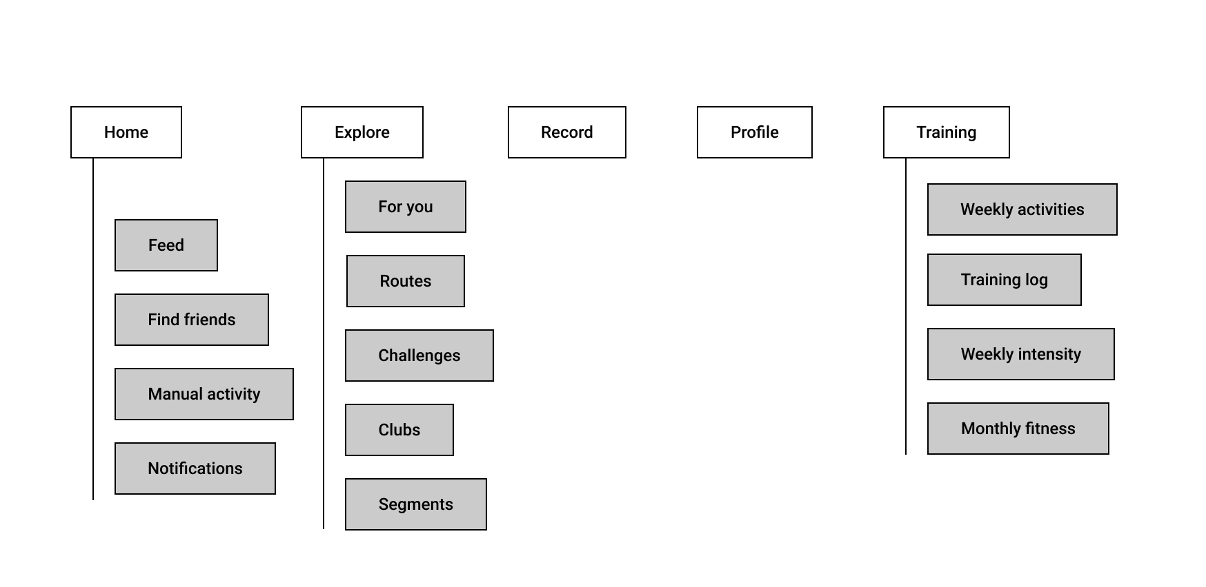
Before the update, there was 5 main areas of the app (for premium users). Home, Explore, Record, Profile & Training.

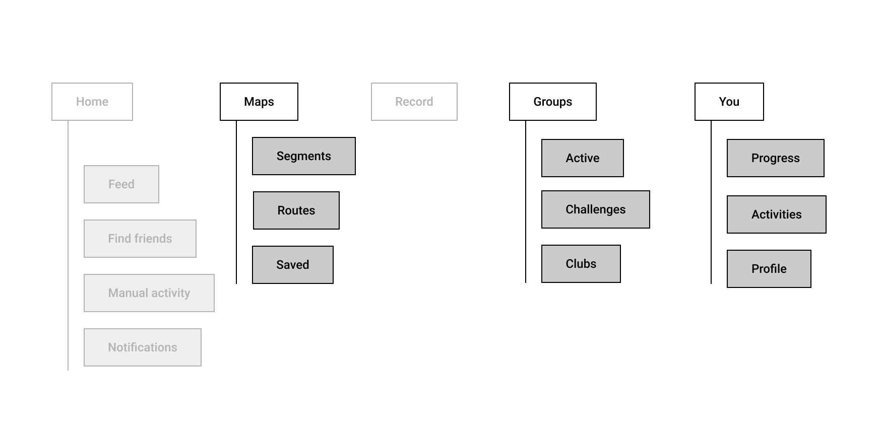
And after, we have three new places. Maps, Groups and You.

Home > Home: Not too much change. We can assume this is used a lot. You are basically checking out your friends activities and giving kudos, one of the core fun things about Strava. Small tweaks to this feature causes massive outcry from the community, like switching to an algorithmic vs time based feed.
Explore? I struggled to remember what explore was before the redesign and had to trawl around for screenshots. This tells me it didn’t really have a clear concept. The landing page for explore was defaulted to ‘for you’. What?? It was a jumbled mess of random social features like ‘your activity a year ago.’ I guess the goal was really to expose the content happening inside Strava that wasn’t neccasarily related to you or your close friends activities. Challenges, Clubs and Routes were also stuffed in here. Routes was a new feature, and I think it has been really popular. It basically allows you to explore (ok that word makes a bit more sense now) and create routes for your next ride.
Explore is now maps. This is interesting. Maps have always been a core part of Strava, but before you would need to find and drill down into an activity to get to a map. It makes sense that segments (parts of a route) and routes hang off this structure.
Record: No change. Like the home feed, this is the beating pulse of Strava. Without a way to easily record a run or ride, there’s no maps, or activities to give kudos for, or Strava.
Groups: Groups and challenges (social things that people do together), have been airlifted out of the burning dumpster that was “explore” and now have a brand new home/tab. There’s not much other changes here, but there’s an interesting “active” tab. So you could think of two problems to solve here. Help users to find clubs and groups, and then engage with them. Seeing groups that are active is important because it’s hard to engage with something if you’re not up to date, can’t see latest activity.
Profile + Training are now “You”. The logic from Strava is “Track your training, search your runs and rides, and view your profile — everything about you is right here.” This is a way for them to not get too stuck in the training silo. And the profile doesn’t give you too much room to grow. “You” is a fairly wide open space to introduce new features that “help you reach your goals”, which could really be anything.
You is subdivided into three areas. Progress, Activities and Profile. So what’s the big change here? One way to think about it. Profile has been demoted. But.. Activities, which was buried fairly deep within profile has been elevated. That tells me people LOVE looking at their own activities. And it’s the main reason they access their profile. “You” is a bit slippery because basically everything could logically fit in this area. But it could also bring some consistency between paid and non-paid versions. Meaning that the top level IA is consistent, but some modules/features may differ within each section.
So, going back to their original goals 1. Make popular features easier to access. 2. Create more growing room for new features, I think there are a few wins here.
Activities are easier to get to. Routes and segments are easier to get to. Clubs and groups are a little easier to get to. It may take a little getting used to finding training stats. Using tabs has given them a bit more room to grow, but may have impacted visibility for things like segments and profile.