Strava Navigation Update
Strava recently refreshed the navigation and organization of their mobile app. Let’s take a look.
Reason for update: Strava has been adding lots of ‘things’ over the last few years. That has made it a little hard to find the popular features, and hasn’t let much growing room for new ones.
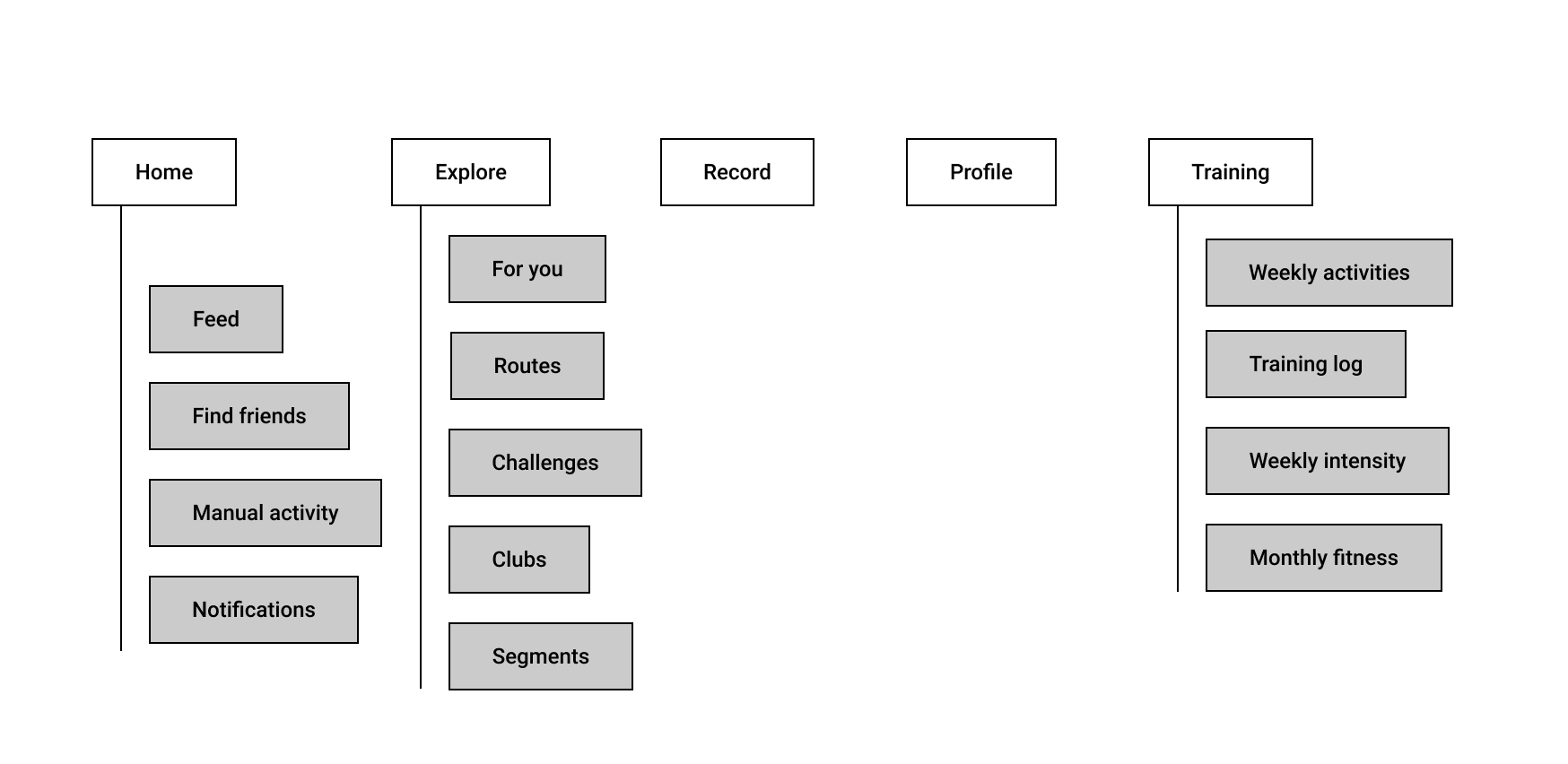
Before the update, there was 5 main areas of the app (for premium users). Home, Explore, Record, Profile & Training.

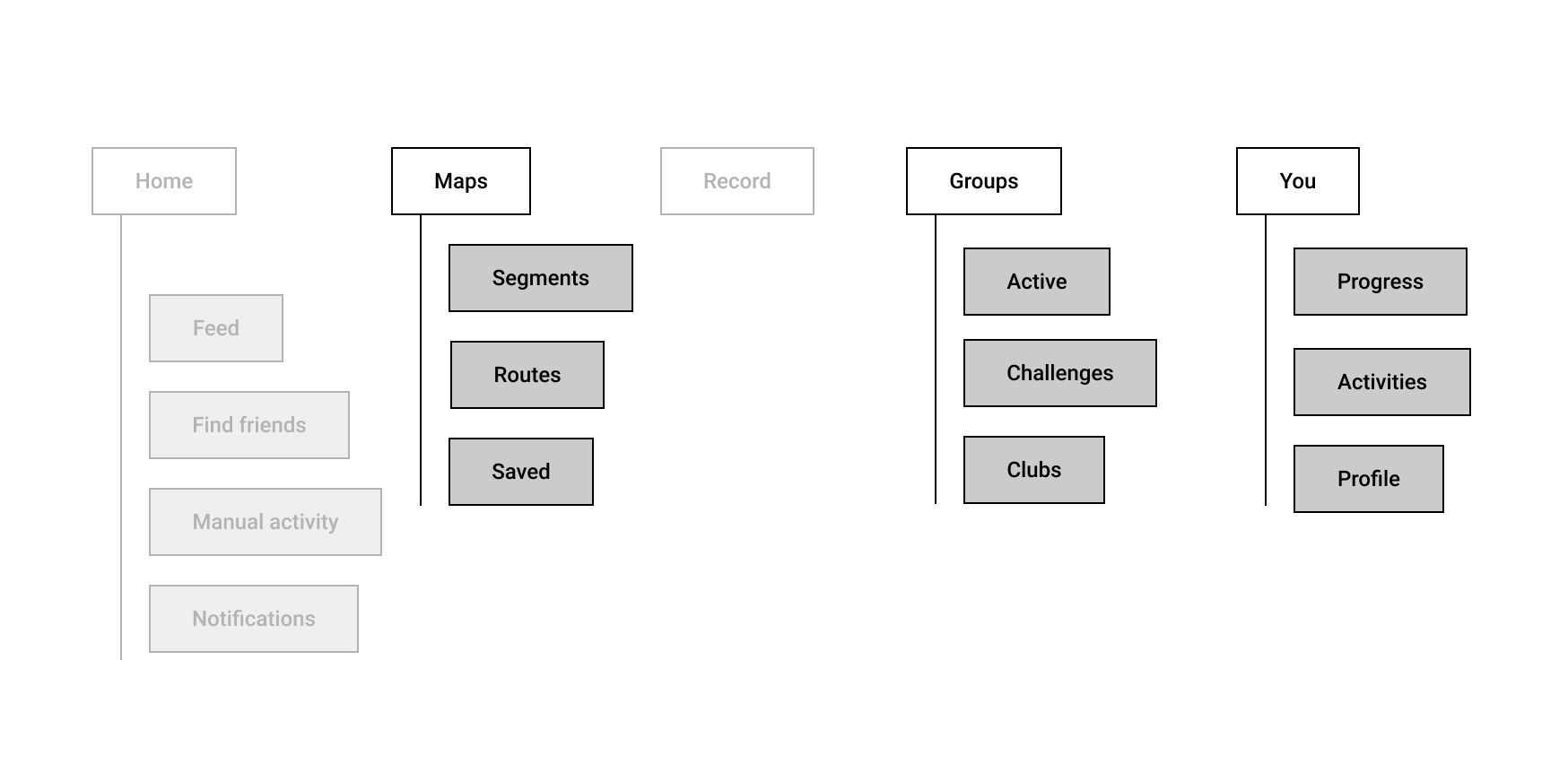
And after, we have three new places. Maps, Groups and You.

Home > Home: Not too much change. We can assume this is used a lot. You are basically checking out your friends activities and giving kudos, one of the core fun things about Strava. Small tweaks to this feature causes massive outcry from the community, like switching to an algorithmic vs time based feed.
Explore? I struggled to remember what explore was before the redesign and had to trawl around for screenshots. This tells me it didn’t really have a clear concept. The landing page for explore was defaulted to ‘for you’. What?? It was a jumbled mess of random social features like ‘your activity a year ago.’ I guess the goal was really to expose the content happening inside Strava that wasn’t neccasarily related to you or your close friends activities. Challenges, Clubs and Routes were also stuffed in here. Routes was a new feature, and I think it has been really popular. It basically allows you to explore (ok that word makes a bit more sense now) and create routes for your next ride.
Explore is now maps. This is interesting. Maps have always been a core part of Strava, but before you would need to find and drill down into an activity to get to a map. It makes sense that segments (parts of a route) and routes hang off this structure.
Record: No change. Like the home feed, this is the beating pulse of Strava. Without a way to easily record a run or ride, there’s no maps, or activities to give kudos for, or Strava.
Groups: Groups and challenges (social things that people do together), have been airlifted out of the burning dumpster that was “explore” and now have a brand new home/tab. There’s not much other changes here, but there’s an interesting “active” tab. So you could think of two problems to solve here. Help users to find clubs and groups, and then engage with them. Seeing groups that are active is important because it’s hard to engage with something if you’re not up to date, can’t see latest activity.
Profile + Training are now “You”. The logic from Strava is “Track your training, search your runs and rides, and view your profile — everything about you is right here.” This is a way for them to not get too stuck in the training silo. And the profile doesn’t give you too much room to grow. “You” is a fairly wide open space to introduce new features that “help you reach your goals”, which could really be anything.
You is subdivided into three areas. Progress, Activities and Profile. So what’s the big change here? One way to think about it. Profile has been demoted. But.. Activities, which was buried fairly deep within profile has been elevated. That tells me people LOVE looking at their own activities. And it’s the main reason they access their profile. “You” is a bit slippery because basically everything could logically fit in this area. But it could also bring some consistency between paid and non-paid versions. Meaning that the top level IA is consistent, but some modules/features may differ within each section.
So, going back to their original goals 1. Make popular features easier to access. 2. Create more growing room for new features, I think there are a few wins here.
Activities are easier to get to. Routes and segments are easier to get to. Clubs and groups are a little easier to get to. It may take a little getting used to finding training stats. Using tabs has given them a bit more room to grow, but may have impacted visibility for things like segments and profile.