My Movie
Every day last week, I filmed a movie.
Why?
No reason. I made a vague promise to myself at the start of 2019 to take more photos. Get better at photography. That sort of stuff. Never did anything. One day I picked up my old Sony NEX and recorded a few shots and got a kick out of it. Once I finally found the USB cord, I uploaded to iMove, and I was off.
How does it work?
My rules are simple:
- Must include more than 2 shots
- Must be longer than 5 seconds.
- No portrait mode!
- Don’t spend longer than 10 minutes editing in iMovie.
- After 10 minutes, share it to youtube
- Never look at it again.
The videos are titled with the date. eg. April 23. The moving images are shot, captured and encoded within the same day. Like a fish, better not leave it sitting in the ice bucket for too long. Get it on a plate. The videos are shared to my account, but are unlisted.
So, Success?
These clips ain’t winning any awards. But I had fun. And I filmed something every day! The simple fact that I spent time invested in editing them, naturally raises their value for me.
Learn anything?
- Something is better than nothing.
- iPhone camera is pretty damn powerful. I switched from a Sony NEX-5N after a few days, mainly for convenience, but I didn’t really notice a huge drop in picture quality.
- I have no idea how to edit. I’m sure there’s a lot of small and technical things I could learn to improve my craft.
- iMovie is really good. Consumer software at its best. Perfect for beginners and I never felt like it was talking down to me.
- You need to shoot way more. Things that you think look interesting look dull on the screen and vice versa.
- After some reflection, I need to do more things worth filming!
Needs & lacks

Most designers would agree that need-finding is an important thing to do. We seek to better understand our users so we can make better software for them.
It’s a central part of the design process. Here’s an excerpt describing what Dropbox Design team gets up to:
Combining research, data, and thoughtful critique, we’re discovering needs and solving fundamental problems that impact work and life for millions of people around the world.
And there’s no shortage of ‘how’ material out there ranging from good to questionable, so I won’t spend too much on that.
Yet in my experience, need-finding is a mysterious, slippery thing.
Why?
It doesn’t really have a definition.
Ask 100 product designers what a ‘need’ is and you’ll get 100 different answers, or 100 non-replies.
The Facebook approach to building software describes a need as a ‘people problem’.
From Julie Zhuo:
_A people problem is a need, issue or opportunity articulated as someone on the street might understand it. _Good people problems identify what people want to do in their daily lives and pinpoint what is broken or unsatisfying about their current solutions.__
eg. “People are bored and uncomfortable on airplanes.”
Charlie Sutton, another Facebook design leader, adds to the definition:
A people problem is human, simple and straightforward.
_eg. “I know how to save things on Facebook, but don’t know how to get back to it._”
Airbnb designer Lenny Rachitsky, has a slightly more loose explanation that includes the business:
A strong problem statement should reference a “need” that is not being fulfilled. Try to focus this around a user need, but can also be a business need if necessary.
eg. “Airbnb hosts are feeling frustrated because they want to improve, but are finding it difficult to figure out how.”
And a good hypothesis will usually speak to a user need.
Here’s an example of a hypothesis from the Patreon product team:
We believe that Patreon creators are highly motivated to use our platform, but experience writers’ block when building their pages because when the customer success team helps a creator launch, most of the time is spent helping them find relevant examples.
And finally, here’s something from the archives, an obscure paper by Rolf A Faste.
We speak of needs as though they exist in some real or physical way. We say “I need a car,” or “I need a house.” In actual fact, cars and houses are not needs in themselves, they are but one way to meet certain needs such as mobility or shelter. The need itself is a perceived lack, something that is missing. Needfinding is thus a paradoxical activity—what is sought is a circumstance where something is missing. In order to find and articulate a need, this missing thing must be seen and recognized by someone.
The products we design don’t always support the needs of users.
You’d think by now we’d have a simple clarified way of building features that are designed with the intention of directly meeting the needs of our users. We don’t.
We’re definitely getting better at it. Before my time, in waterfall world, a large requirements doc would be plonked on the desk of an engineer. Filled with functionality but with no rationale of why it should exist.
We’re getting better. Design thinking, love it or hate it, aims to put much more focus on the end-user before anything is even typed up into a doc.
But can we do better?
Conceptual design: A software design approach
Daniel Jackson, a MIT professor, thinks we should build software incrementally in ‘concepts’ that all have a purpose and are designed around the needs of users.
An example: Think about ‘trash’ on a mac. It’s a concept. The purpose? Allow the undo of deletions.
Imagine if every time you deleted something it was immediately gone forever? That would suck. It solves a problem for a user and makes the software a bit more friendly.
A more 2019 example might be the ‘hold’ function on a Jump bike. ‘Hold’ is a feature, a concept, a solution. And it’s connected to the need of a casual cyclist. A lack.
Users of an earlier iteration of the app may have said something like “I wish i didn’t have to restart my ride every-time I stopped”. Or, I locked it and I came back 5 minutes later and someone else had reserved it! Or maybe Uber noticed people were leaving their bikes unlocked and running so they could stop by multiple locations rather than just riding from A to B.
Designers perceived a lack, something a bit ‘broken and unsatisfying’ and sought to solve it with a concept called ‘Hold Bike’.
I don’t think concepts solves the inherent muddiness of solving user problems but I love two things about it. 1. It’s simple and easy to learn. 2. It maps directly to how we build software. It’s not to different than a requirement, a bit of functionality or something that could be built in 2 weeks.
To design learnable, effective and tolerant systems, designers should be thinking about concepts (and their related purposes).
Looking back and forward
Today marks Thomas Jefferson’s birthday.
It also marks the day I left Melbourne.

April, 2014
On that day, I committed to go out into the world and do something (not be someone). I’m happy I did, but I’m also a little surprised by this version of myself. What was he thinking?
If I was to meet myself 5 years ago, I think we’d both be shocked and delighted by what we saw.
And vice versa.
My past self would appear naive, ignorant, stubborn, close-minded, but also optimistic and idealistic. Hungry.
And my ‘future self’? Americanized? More relaxed? More confident? A bit friendlier? It’s harder to judge.
But what makes me happy, and what tells me I’m on the right track is I would surprise myself.
I would have so many questions for myself. You live where? You do what? You did that? How? Was it hard?
So next time you’re looking over some old photos, make sure you’re surprised by what you’ve done, and the person you were, and pleasantly surprised by the strange version of your life that you find yourself living today.
Areas of interesting
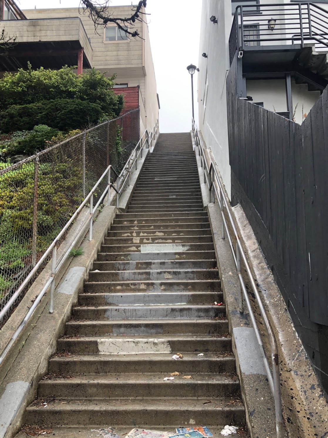
Arbol Lane, San Francisco
Most runners know where they are going to run. We want to run, not check for directions.
But how can we make running a bit more interesting, without sacrificing your workout?
Recently I’ve been forcing myself to create new routes for myself. Partly for fun, and partly to explore new neighbourhoods and streets that I would otherwise miss.
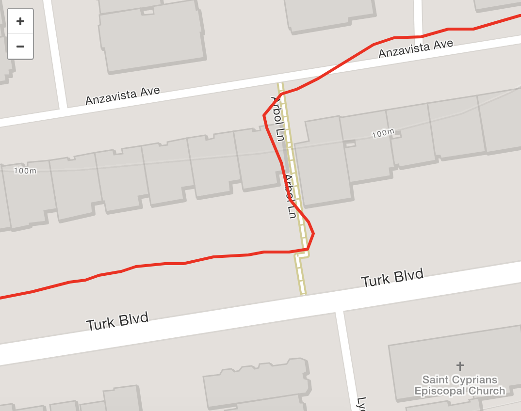
A quick detour recorded on Strava
How would that look in a product?
I could express interest in categories like “areas of interest”, “super steep climbs” or “secret stairways”. Once I’m on my run, a subtle buzz or glance at map would highlight close by spots that match my interest. For example a hidden stairway. One more tap would add it onto my route, or show me directions. After my run, the stairway is tagged onto my workout, surfacing the stairway to the broader community.
Other ways you could take this is a typical “explore” jumping off point that included curated routes, tours, popular runs etc. This is actually something google maps has been doing as it ‘explores’ other ways the app can be useful aside from just A-B directions.
Running apps are a great tool, but I think there’s so much more they can do!
