“You should try first dates with me. I found that on date 1, I was saying let’s talk about death and loneliness. Let’s talk about how we’re all going to die and isn’t loneliness amazing and isn’t loneliness this thing that I’m fascinated by because we are so afraid of it… It’s with us all the time. People are so terrified of this abyss of loneliness, when it’s something beautiful within us.”
Marieke Hardy loves talking about loneliness on her first dates, which prompted me to think about how those things connect.
Loneliness is something that a lot of people suffer from. We’re scared of it, and we’ll do anything to get away from it, including really long, bad marriages. There’s a fundamental need to for people to connect and basically feel less lonely.
Marieke also mentions that people can feel lonely even within relationships, which are often thought of as a solution.
Usually we think of a good relationship as a safe, fun place to be yourself with someone else, who sees you, and you see them.
What can be tricky, is trying to show that real self, online of offline.
I think this applies for all kinds of relationships, friends, lovers, business partners.
You just want to be seen, and see them.
Take expats for example. I’m an Australian expat living in the States. I’ve been over here for a few years, but my experience is still fresh enough (and tough enough), that I would love to meet people going through the same thing. I love (most of the time) meeting Australians who work over here, and hearing their stories, helping them and sharing that connection.
Right now there’s a few options to meet people who share very similar life stories (eg. grew up with foster parents, grew up in Indonesia and now work in London, queer and served in military). Friends. Digital groups, meetups.
These work, and are a good starting point. We’re definitely getting better at matching.
One idea might be a network where you can join a group anonymously. But the groups are a bit more vulnerable than just generic topics, subreddits or groups you might see online. Maybe they are more like statements you agree about, or want to talk about.
“I’m not happy in San Francisco.”
This is a statement you would probably never see on a dating profile, unless reworded in a way that signals intelligence, or total ignorance to basic social rules. But it’s also a sentiment that I think many would agree with. The question is, would you admit it in public to strangers. And would you even want to date strangers who are also not happy. Maybe not.
“I work in tech, but I’m not a techie.”
This is a bit more neutral. This is a story that says, I make money I’m smart, I’m interested in solving big problems, but I don’t have an engineer personality.. I want to have a discussion about art, not algorithms.
So how do you get involved with that statement?
Maybe it’s anonymous.
Now it’s just sounding like Reddit!
And that’s never going to solve loneliness.
Mind Milestones
When we think of big moments in your life, they are usually real, tangible things.
You know, stuff you can stick on a vision board.
A bright white wedding dress.
Eating a takeout on the floor of your new house.
A new job title on your resume. “Manager.” “Director.”
These make sense for a few reasons.
- They make meaningful difference in your life.
- They are external and can be seen and understood by others. And most stuff in life involves at least one other person.
- They are easier to visualize and set goals against.
But here’s a radical idea.
What if the major moments in your life are actually internal?
What if you celebrated moments when you thought of yourself differently? Started liking yourself. Moved past a fear that had guided a lot of your decisions.
These are hard for others to really notice from the outside.
It’s harder to quantify. It’s hard to pinpoint growth like that. But I think we should try to.
These changes are no less significant than the surface layer stuff.
Personal Website
Good is the enemy of great. And there’s no place where that principle resonates more than with designer portfolios. There’s a long trope within the creative community that building your own website, blog or portfolio is a sisyphean task. It brings little joy, and will never be finished.
What I made
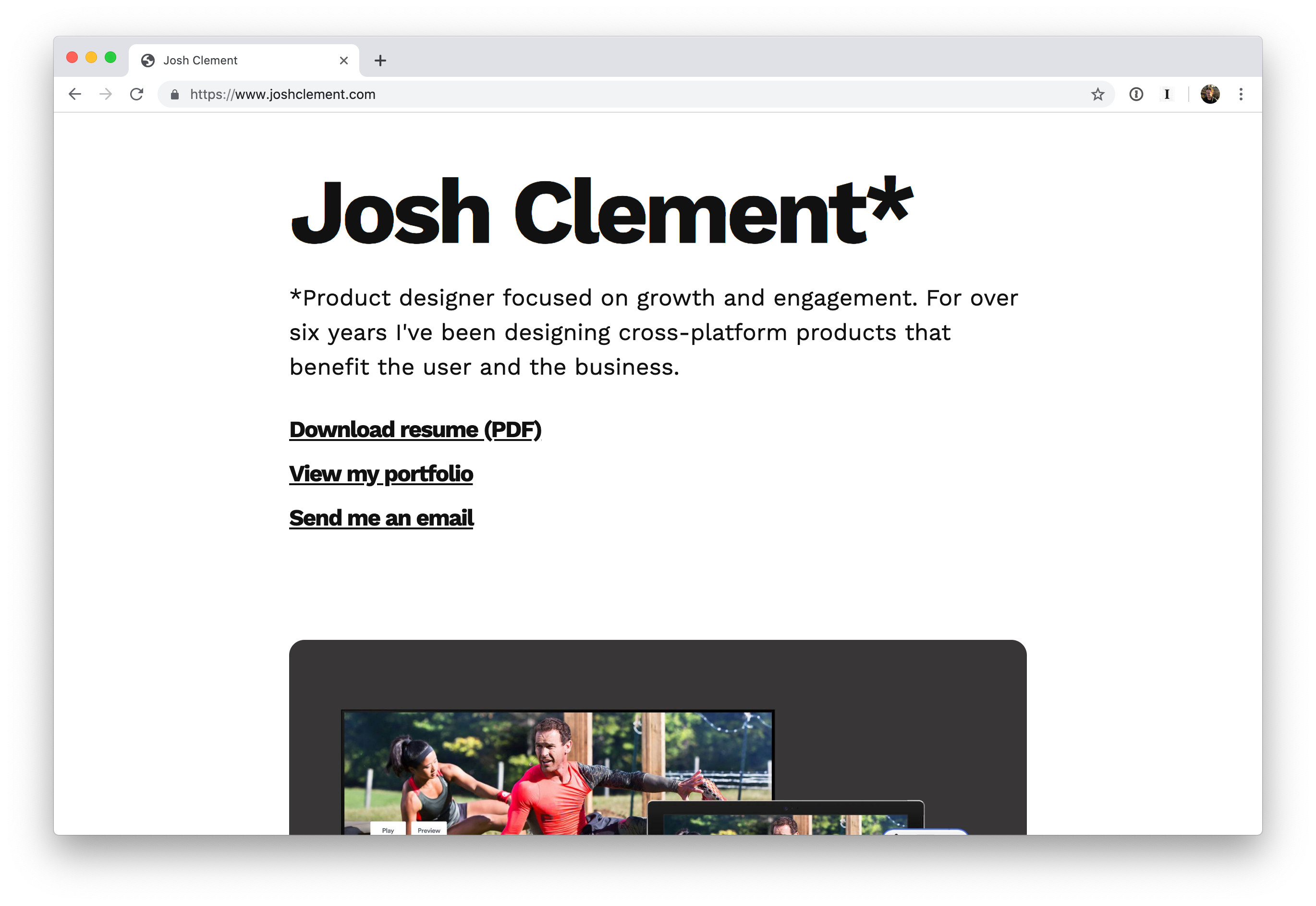
I’m happy to announce that I actually did something. joshclement.com. It answers the brief, and hopefully communicates to readers who I am. The code is on GitHub. I can edit and push directly to my repo and see the changed in a few minutes.
Pre-History
Backing up a bit. I’ve owned joshclement.com for years. For most of the time, it’s been pointing at a Tumblr blog. Recently, I’ve ported my entire Tumblr onto blot.im, a lightweight blogging service. Why? With the future of Tumblr questionable, this seemed like an easy win, and saved me from going too deep into static site generators and stuff like that.
Anyway, with my writing now safely stored on joshclement.blot.im, I needed to think of what to do with my primary domain. I needed my own website, a place to plant my flag and tell my story. But what should I say?
Portfolio World
Building your own website as a designer can mean a lot of different things. For some, it’s a full on portfolio, for others, it could simply be their name and a contact link. I wanted something in between. I started with a bit of research, looking at 100’s of websites associated with ux designers. These ranged from comprehensive portfolios with detailed case studies to the classic “I’m happy with my current job” business card sites. I spent way too long at this step. There’s a lot of beautiful portfolios out there, and I should have been getting started.
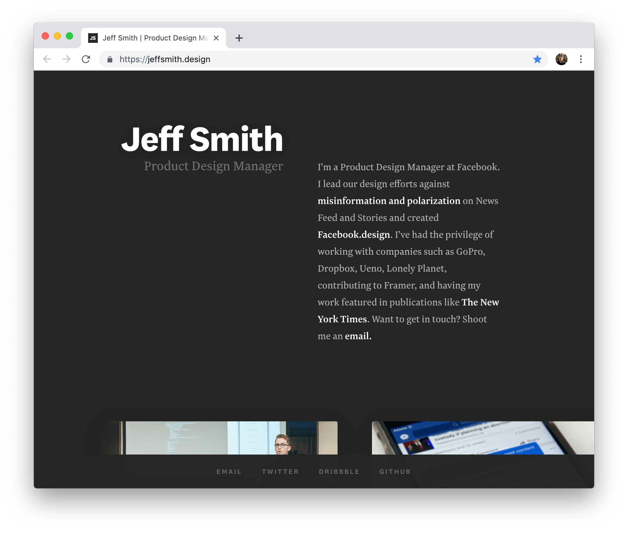 An example I liked
Eventually a portfolio site by Aaron Moodie, showcasing a few project thumbnails broke me out of my procrastination. It’s since been taken down, but it showed a short bio and a few images of recent projects. This gave me the inspiration to get started building.
WYSIWYG
As I was looking around at what other designers were doing, I looked into Adobe Portfolio. It’s a new-ish product that gives creators wysiwyg tools to create their own online website. Since I already use Creative Cloud, and Behance to host my recent work, this was an attractive option to me. After playing around for a few hours with designs, I realized I was just reinventing the wheel. Behance does a good enough job to host my work, so I decided that my personal site would simply link out to Behance and that would be that. Plus, I get a real kick out of using git and html/css, so this could be an opportunity for me to do a bit of coding.
The MVP
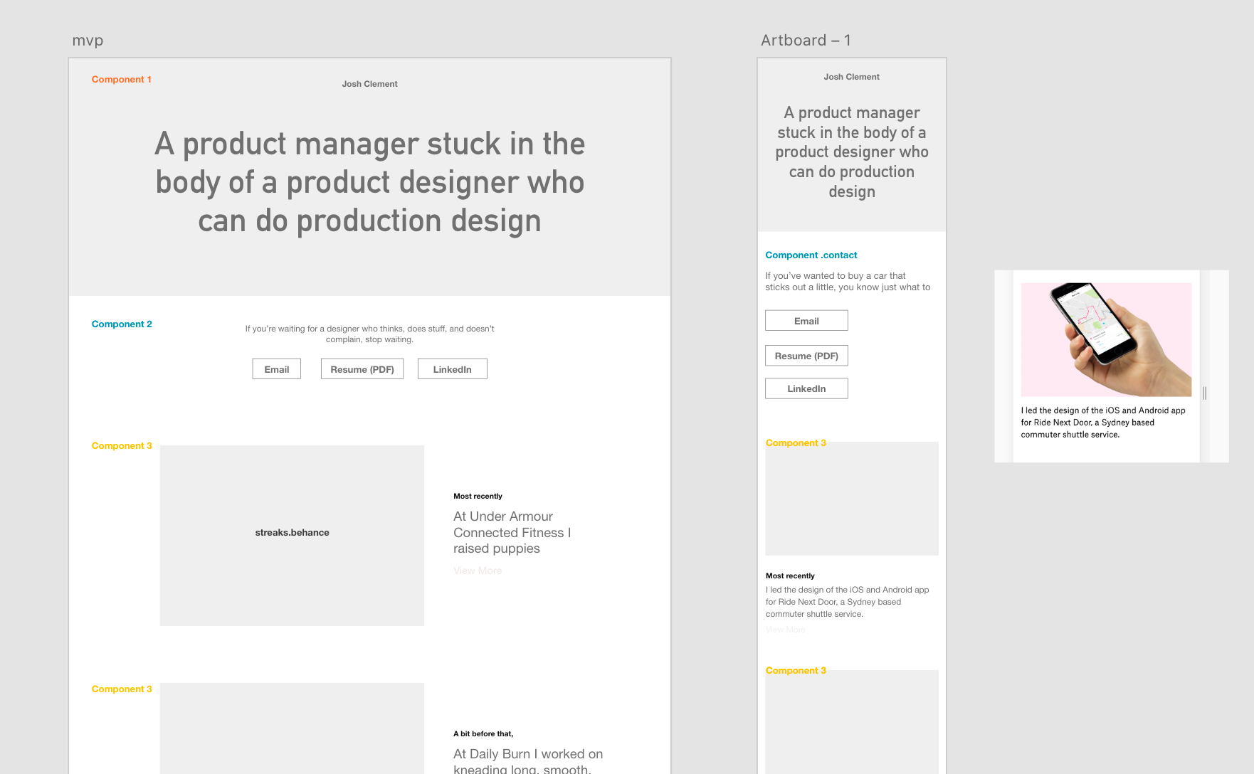
Now that I’m settled on coding my own ‘one pager’, the next step is to figure out what the MVP might be. Thinking through the lens of a recruiter, I knew I needed prominent links to my resume, portfolio and potentially an email address, coupled with a snappy bio (a few sentences that describe my unique-ness) and maybe a picture of myself.
After that, the idea was to hero a few projects, maybe include some other links to peripheral work, and that’s it. I used Adobe XD to sketch a few simple concepts. This left things like ‘sticky nav’, dynamic layouts and branding elements off the table for V1.
$ git checkout -b landing-page
I started building out the site. I created a new branch, since I planned to host from a personal repo on Github. I used Tachyons since I had a little bit of experience with it, and it’s a really great way to bootstrap a project. What I love most about tachyons is some of the decisions made around the type scale, type measure. It’s easy to get the type working well, and it’s one less decision to make for a project like this. Looking back on this step, I should have focused on getting the writing to a good place before adding it into the code. Eg. Get the layout and design right, port in the text you are happy with, and then make smaller tweaks, rather than doing both at once.
Writing
For the most part, I’m writing copy on the fly. For a while I was using copywriting from vintage advertising as placeholder text, because it was fun, but I’m slowly thinking about what should actually be where. I want to sound smart, and different, but I think the right approach for V1 is to tell your story as simply, and clearly as possible.
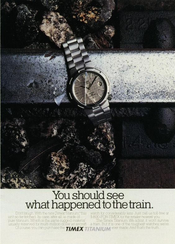
I used copy from vintage advertising as my placeholder text, just for fun.
Refining
The plan from the start was to include 4-5 links to my projects. Each project would have a big cover image, a title and a short description, and link out to behance. Once I built it, I realized I had just recreated Behance. I stripped it back down to just a few sections. “My Work” which would be the sole link to Behance. “My Story” which was a short bio and picture. “My side projects” and “My writing” would be little article blocks that I could drop in. Next step was making sure everything was linked up, copy was final and I liked the overall layout. I decided on Work Sans as a hardy, bold font and included a CSS dot pattern for the article blocks. Purple was the highlight color, but aside from that the only color would come from the imagery.
Push master to origin
I shared the site with my girlfriend, a few friends. Most feedback was around the copy. So once I merged the branch to master and made the site live, I kept pushing copy edits for a few days.
Next Steps
I really don’t know who will see this thing. All I really wanted was for there to be a bit of substance on my personal domain. In a perfect world I would have my work, and writing all in one place, but in my experience, removing friction from sharing your personal work is more important than glossy, sexy systems. I’m able to blog with one click of a button and share work on behance with drag and drop. As long as a recruiter can see the things they care about (location, resume, linkedin, folio), that’s fine for me. Using GitHub pages has been super simple, and it’s been fun to crack open the text editor again!
