748935041


Banners still killing it, in both regular schoolboy graphic design, and as devices in editorial design (where i think they’re better suited).
What is the cover font for Dazed and Confused (MIA cover)? It looks mad, reminds me a little of the font used on Sagmeisters things ive learnt cover-all the letters are really unique, but it doesn’t look goofy or jumbled.
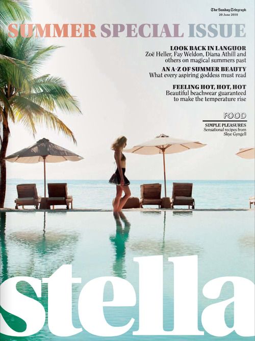
I included the Stella cover because it used Utopia black headline (the esperanto logo uses this) and i like that font!