26975004213
Bad design patterns.
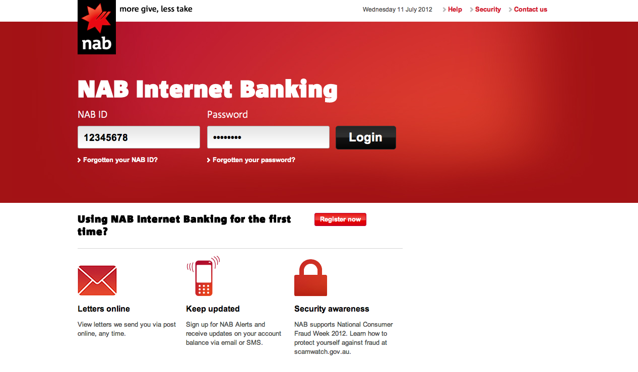
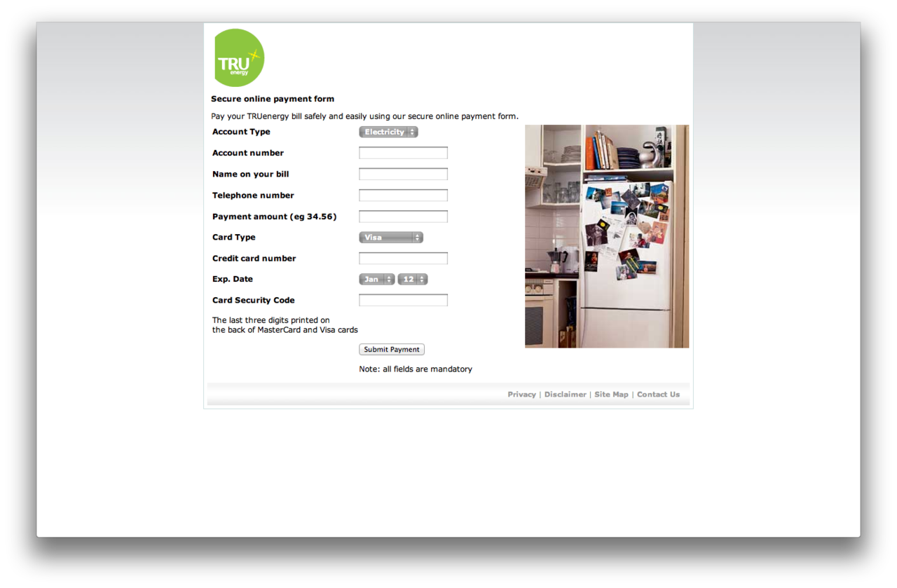
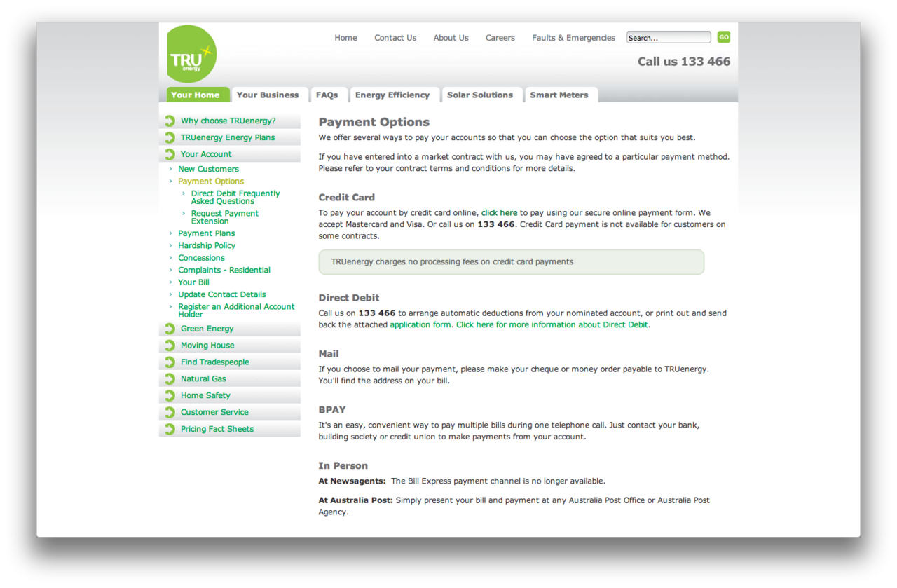
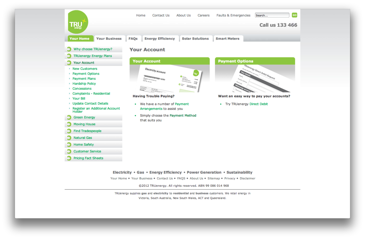
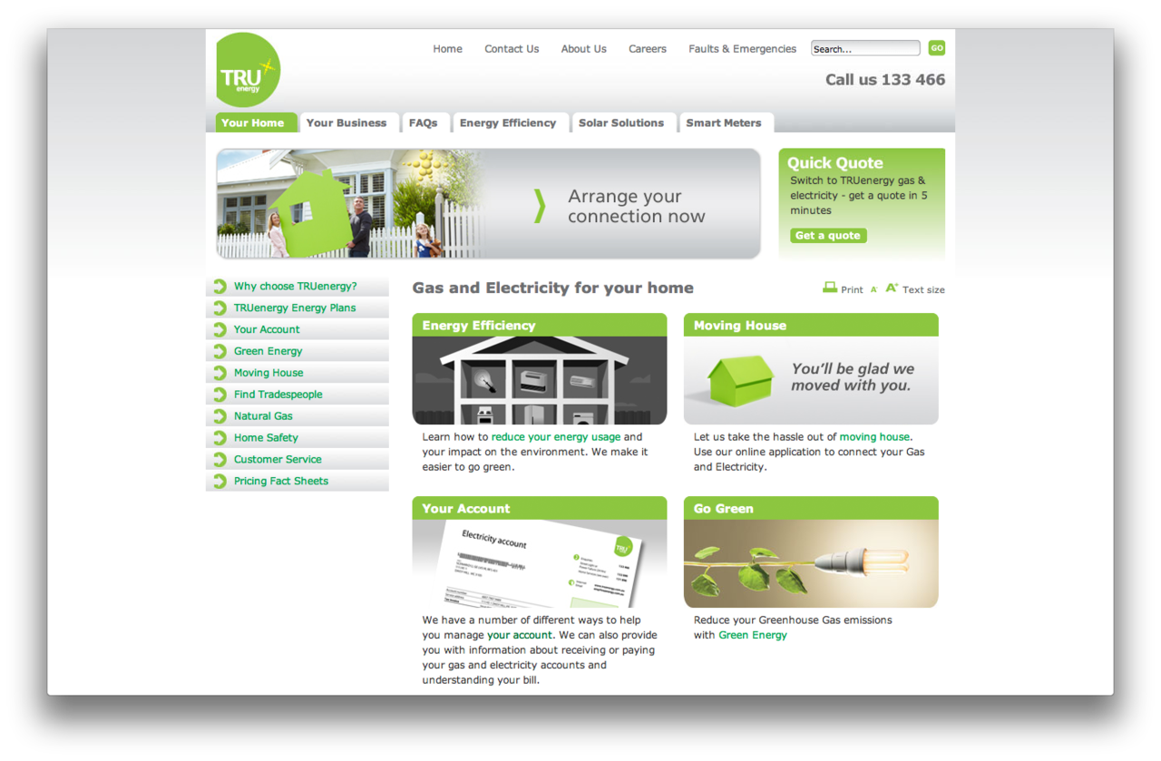
When I’m paying a bill, whether it be electricity, gas or my mobile phone, I want to get it done as quickly as possible. I’d prefer to login, and for that to be simple like the NAB page, but if I can’t, I don’t want to play guessing games on tru energy, one of the most boring and confusing sites I’ve seen in a while. When you finally get to the payment screen, it doesn’t even look official (it’s actually hosted through cardgate.net a thirdparty thing).