205009533


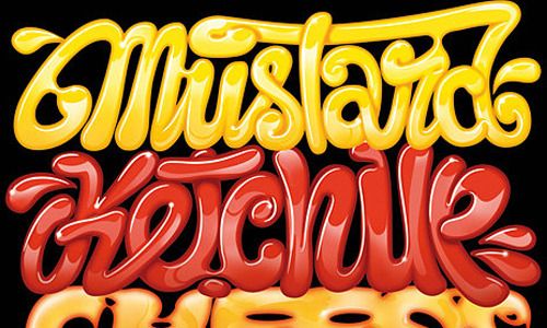
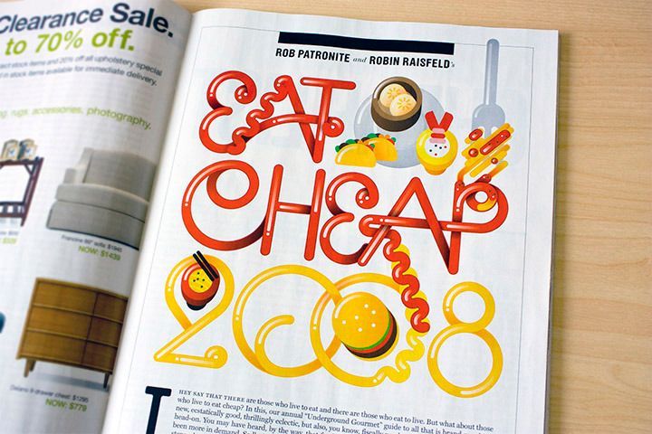
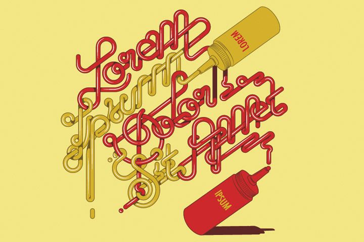
I’ve started getting used to blogging these comparisons, but not sure what I’m trying to prove. I like to think of it as a current trend that is backed up by two heavyweight designers. If they like it, so do i. This one is ‘mustard and ketchup typography showdown’.
Also been liking Always With Honor from Portland. Great illustrations, with that stripped back, childish, colourful style.. I can’t really explain it but it looks good at the moment. That boat infographic (below) is by them.
I wanted to mention Jessica Hische. she had the best graphic (in my opinion) at Some Type of Wonderful (last friday).. any graphic based on supersoakers is a win in my books. When I find a decent picture of it I’ll post it asap.