133418511607
A bit of progressive disclosure from Dropbox.
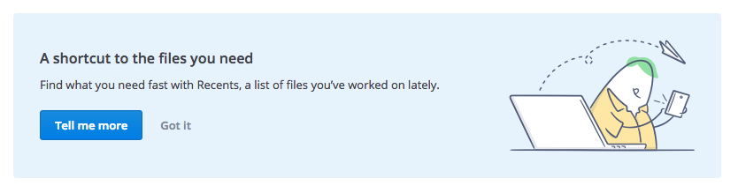
The standard tooltip. Not too intrusive, this is the navigation/informational piece.
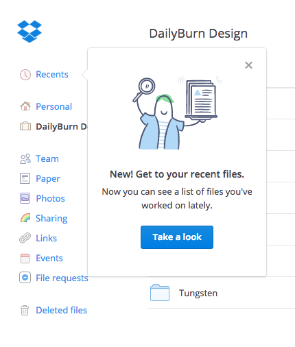
User shows interest, decides to ‘take a look’. They navigate to the Recents page, where they can play with and look at the feature itself (which is fairly self-explanatory). A sticky block remains on this page, to further explain itself. It can be easily dismissed.
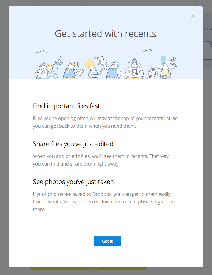
Only after users have jumped through ‘take a look’, and ‘tell me more’ hoops, does Dropbox go full force, black out the UI and show them a lot of information.
I’m sure this feature has been validated by a lot of user research, so they know there’s a need, and the interface itself does its best to make clear sense and speak for itself. The sequence of information presented to user is clever because it is guided by user behaviour. If you ask, dropbox can answer, if you don’t, dropbox can get out of the way and let you get back to work.