When magazines go digital, and win.

Businessweek is a good looking magazine, pumping out Wired-esque covers and spreads under the creative direction of Richard Turley.
What’s most impressive is their clean transition online with punchy images and copy (like you’d see in the mag) alongside (fairly) innovative front-end stuff like sticky nav bars, >16px body type and even basic details like custom-coloured text highlighting.
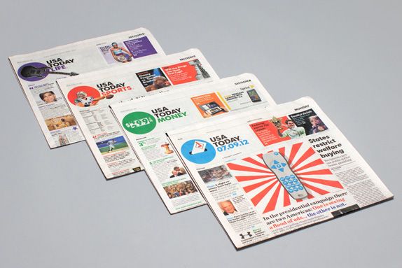
Another good example of this confident, colourful design approach is the USA Today rebrand by Wolf Olins.
Wolf often kick up a fuss in the design world by conceptually going too far in one direction (ahem London 2012 *cough), but I’d argue that they’re usually ahead of the curve. Take the CurrentTV rebrand an animated logo that truly stands out amongst thousands of shiny, reflective vector pieces of poo out there.
I’m all about this new USA Today look, and I think their site really raises the bar for news and really any other site that updates a large amount of content daily.
Another few examples of magazines doing awesome jobs of translating their content and design into the digital space are Fast Company, and Good (who are currently beta).