The visual language of Nike +
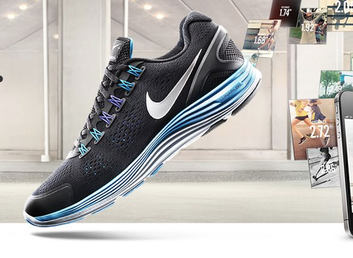
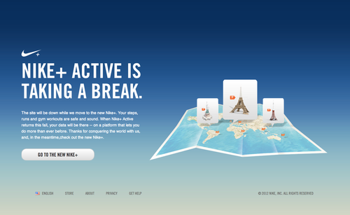
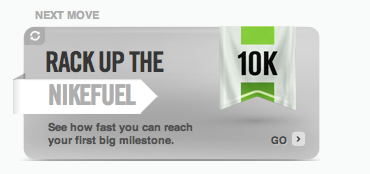
This recent work by R/GA for Nike+ blasts a hole through all those dribble shots of lightly textured, smashing magazine-era design. It stands out purely by how hyper-real it looks. Nothing has a natural light source, every colour has been boosted and is glowing like a slam-dunking spaceship.

I interned at Sneaker Freaker and I got pretty good at photographing shoes, but I will admit nothing got close to the lighting on this one.


I think “Fuelie” the breakdancing robot mascot of Nike Fuel makes my point.
Apple’s website used to be cutting edge with long scrolling pages, lots of white space, big type and perfectly manicured app icons, but due to a lack of updates and an abundance of copycat designs, it now looks a little tired.
To further prove my point that Nike is redesigning recreation for the electronic age, here’s some footage of their space sports camp. (lot’s of glowing stuff).
(via Dribbble - Supernova by Ray Sison)