The Dieline
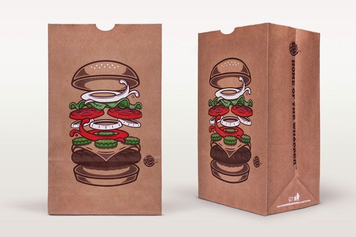
Burger King always seems to have their shit together when it comes to ad campaigns (and food) especially in comparison to their antipodean other half Hungry Jack’s. This packaging refresh is dope! Such a good idea clearing away all the copy, which is funny because McDonalds did this thing where they covered everything with copy, and had to design a 30 language plus new typeface with glyphs coming out their wazu. This appproch seems a little more lateral. David Iglesias (via Burger King - TheDieline.com - Package Design Blog)