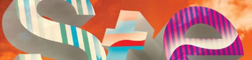
Stereosonic, in logos
I won’t be going to Stereosonic. Not my thing, although I do like a lot of the producers/dj’s playing. No cobra snake photo for me :(
The designer of the poster had also created logos (some real, some not) for the dj’s on the bill. I picked out a 5 different ones and rated ’em.
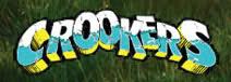
This is actually Crookers’ logo. I like it because it reminds me of all the pop punk bands I used to listen to back in the day, with the wacked perspective and crumbling brick texture. Also reflects their in your face music. 4.5/5
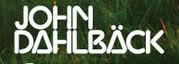
Nice custom logotype for minimal wizard John Dahlback. Some letters work like the A, but the N is retarded and the B looks pretty messy too. 3.4/5
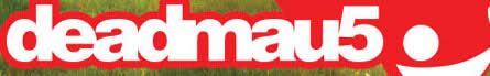
Along with being one of the biggest and most respected electronic artists in the world at the moment, Deadmau5 has a solid brand behind him. Masks have been around for a while in electro; and he dons it for photoshoots as well as at his shows. This works for the logo, but then you’re you’re left with ghey helvetica neue, scrunched together; a look that has become dated. 5 for the mouse, 2 for the ‘deadmau5’.

Speaking off tightly kerned swiss… The one thing I do appreciate is the olive wreath, but they don’t talk to each other. I’d drop the Axwell somewhere under the ‘A’ but probably all caps and smaller. 4.5 for the wreath, 1 for the type.
![]()
Last but not least, a disco dust type treatment, transforms bass heavy drop the lime into something that looks like the title of a 80’s ski/murder mystery VHS. The type has no correlation to his sound (more house then hair metal), but looks aggressive and unique up against the others, similar to the way the Crookers logo stands out. 4/5
I’ll be posting less often (once a week) as I’ve recently moved out of home, and I have no wi-fi anymore. Sorry?