“Prompt”
’A users understanding of your application improves over time.’
The more we use these apps, the better we get to know them. The app doesn’t become more efficient, we become more efficient at using it. We make up our own shortcuts, we prefer working full screen, or we style a unique layout of toolbars and actions to save as a preset. At my work, when all the creatives upgraded to Adobe CS5.5, there was a collective groan heard as we booted Photoshop out of the box. Back to sleeping in a hotel bed, everyone quickly got to work dirtying the sheets.
Elimination > Substitution
We love to personalize stuff, and for me that’s a process of elimanation rather than substitution. When I started my job I had a desk lamp, I never used it, so it got the boot. If I have an app on on my iphone that I haven’t used for a week, it’s off the home screen. If I don’t use it for a month, it’s gone. Call me a minimalist, but that’s just the easiest way to properly use stuff. Clearing away all the dead wood makes it easier to visualize the cabin you’re about to start building.
A lot of apps understand the idea of doing one thing ultra focused: In Instapaper, the nav bar disappears after one scroll. Scrolling = reading. And reading means reading, not looking at icons for other functions.
In the writing arena, I’d argue that no one has iAWriter beat: “As soon as you type the title bar disappears and all you see is the clean typing sheet, distraction-free, ready for your ideas to take shape…(Creating a) noise free writing experience.”
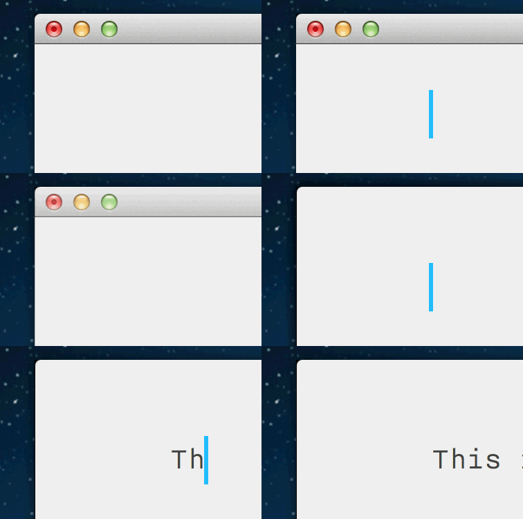
If I have to write something, I need minimal distractions, and I count buttons and menus as distractions; a reason why I lean away from Microsoft Word and towards programs like text edit, tumblr and Google docs.
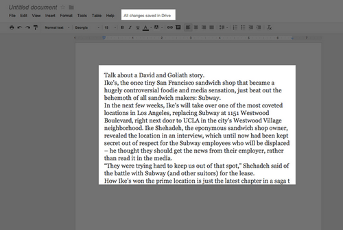
Start typing to begin…
Why can’t this design philosophy be used more freely across other basic tasks on the computer? With Google’s omnibox leading browser interactions, and browsers (starting to) lead OS interactions, we’d start from there.
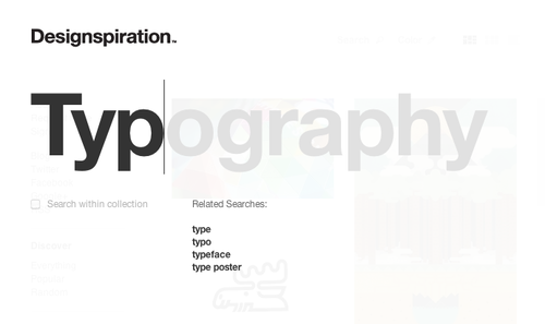 • The user would begin by typing a simple task, and suggestions would instantly flood in: By simply typing the letters c,a,l would have “Call Mum” populate the field. Designspiration already employs this technique on their site.
Really nothing new here, as far as omni-box stuff goes. In fact, my current workflow, is command T to create a new tab in chrome, type out a shortened phrase that Google already understands eg. “gmail” (I’m happy to type 5 letters rather than wait for suggestions) and smash enter. Boom. Email.
There’s something really liberating (as liberated as you can get when you’re simultaneosly glued to a screen and a chair), typing over the top of everything else, doing away with all the buttons, frames and containers that usually clutter our computer screen.
![]()
Many things we do on a computer all the time are slow, bloated and carry way to many features. Let’s take a look at email. When I launch gmail, 90% of the time I’m doing one of two things. Looking for bold text that tells me I have new mail “Inbox (3)” or I’m heading about 5 pixels north and clicking that red button. That’s it.
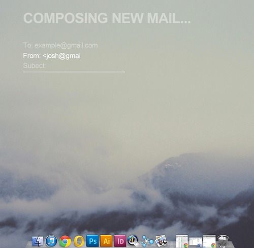
So how would a prompt based email message work? Once you’ve omniboxed your request, you’d see something like this (above). In this screen, the user has already locked into new mail mode. As soon as a task is completed the type falls back, lowers in opacity and generally gets out of the way. All that is important is the now, the current. Which is in white.
This really isn’t that left-field, Gmail now uses a simple pop up box to write new messages as of a few months ago. It sits in the corner or the browser window waiting to spring up, rather than stretch itself across the whole window.
It’s clear that this is the way speech-directed stuff is going (eg. Google Glass) “Ok Glass, film this junkie on the tram.” “What did you say c*nt!!!”
In the meantime, and while we still have unobscured faces, we’ll be using those big computers on desks. And we’ll be needing them for simple, civillian tasks like adding, messaging and planning.
We’re all pretty good at typing stuff. And we like shortcuts. My brief stint at playing Memrise (I hot streaked 92 learnt things before i dropped it from my bookmark front bench), taught me that arrow keys, the return key and numbers 1-6 are actually quicker and more intuitive than clicking everything with a mouse.
Apps stripped down to their bare necessities is a lean, mean and scary sight, and only a few less steps away from them “disappearing inside us completely.”
EDIT (31/3): This idea already exists in the form of the app Alfred. It’s free, and I’m downloading it as I type…
