underconsideration.com

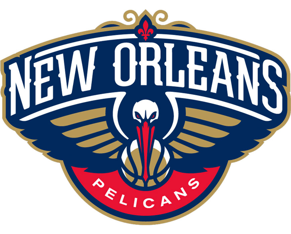
The first time I saw this (a few days ago on dribble), I liked it: very strong and stylish, maybe too much so as it looks like a t-shirt graphic rather than a logo. But then I found out what logo it was replacing: The Charlotte Hornet! Growing up in the 90’s I always though there was something extra-terrestrially cool about that mark, and I’m sad to see it go.
“I didn’t consider a pelican to be a rather intimidating animal like other NBA teams a la Bulls, )Grizzlies, or even Hornets. Plus, they are rather goofy-looking animals. And perhaps because of those preconceptions the Pelicans had to go with an extremely pissed off pelican, which looks remarkably good. By avoiding a profile shot of the pelican they were able to get past that awkward beak shape and by using a front-view they could also place focus on the wings, which are always a good visual device to work with.”
(via Brand New: Rise of the Pelicans)