130220081017

“Wishful Thinking” – I helped co-author a newsletter about ‘cognitive biases’ this week. Stay tuned.
130212008712

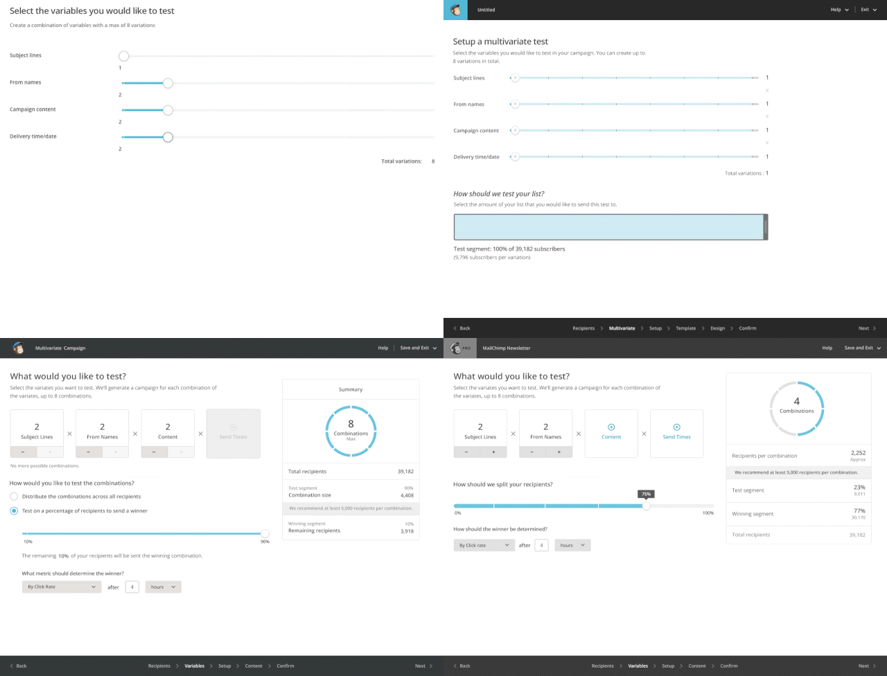
Design iterations of a variable selection interface. Unnecessary complexity simplified is always a win. Via Mailchimp’s UX Newsletter
brainpickings.org

Leisure the Basis of Culture
Josef Pieper
In 1948, an obscure German philosopher penned a magnificent manifesto for the value of leisure as a way of reclaiming our human dignity amid a workaholic culture. Today, his wisdom is timelier than ever:
129862202857

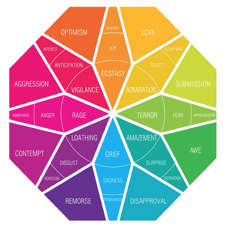
What are you experiencing right now? 😨
via Institute of Design Stanford
Measuring Satisfaction

Satisfy (verb): to fulfill a desire or need
Last Wednesday, Van Shea Sedita of Capital One Labs spoke at a local UX meetup about “customer satisfaction.” He talked about something he called a COSILT score (“Chance of Satisfacation If Launched Tomorrow”).
TL;DR: Van met with ‘power users’, observed their behavior and created a satisfaction score for each person.
Firstly, a group of about 15 dedicated users were selected from a pool of survey responses. The survey that was sent out included questions like “Where do you live?” and “When are you available to meet and chat?”
From there, he created a personalized email that confirmed a time and place to meet. He admitted he had a bias towards users who lived near their New York office, to make travelling easier.
Capital One has 4 customer archetypes (which he uses as his desktop background). Prior to meeting the users, he had made some rough assumptions from the information they had supplied. He was interested to see how wrong or right he was when he visited them in their homes and learnt more about them.
The prototype he showed them was for a new iteration of their mobile app. It was an offline invision project on an iPhone which mapped out a “happy path”, meaning that only some buttons worked, and no personal data like bank balances were used. He later admitted that removing data from the prototype influenced how they might react to it.
The meeting lasted about 45 minutes each. He tried to remove as much of his personality from the interaction as possible and focused on them. He told them “the only thing you can do wrong is tell us something we want to hear.“
The goal of the interview was to better understand customers by listening to what they said as they used the prototype (often in their own homes, workplace or a coffee shop). He attempted to observe their habits, body language, reactions and exact words to build a better picture of who they were.
After the interview finished, he listened to the recording, looked at his notes and had a gut check.
He asked himself: Was the person struggling, apathetic, disconnected, bored while interacting with the prototype? Did they say non-committed stuff like “yeah I might use this.” Or did they say things like “Why doesn’t this exist already, I needed this yesterday!!!” Did they start walking around using the prototype while easily managing other tasks in their home environment?
Compiling these notes, each interviewee was given a (Chance of satisfaction if launched tomorrow) score (0-100%). That score would then be used in combination with existing user archetypes, to aid in the iteration and continued design of the app.
It was an interesting process that he undertook, but nothing new in terms of design research, prototyping and testing. It was a ‘Data’ meetup, so there were many passive aggressive questions about confirmation bias, his method of selecting users etc. These were valid ’scientific’ concerns, but I think missed the bigger picture. In the process of understanding the problems, feelings and beliefs of his customers, he discovered “a mosaic of customer experience considerations”.
