Great Design Happens In The Open.
A few notes and quotes around design visibility, or as we like to say “socializing”.
1. Uber shows work
This was from a conversation with a designer at Uber. The key thing was speed. Uber is a big company with lots of things going on, and spending weeks polishing a design is to not going to ensure it’s success. It’s not just about showing it early, it’s about rapidly folding in feedback. And you can’t get feedback without showing
His process was: get something rough (but never wires), get feedback and action it immediately. By the time the work is shown to high-ups, it’s in a good place and gets sold. The feedback rides along and gives the work a gleaming armour. I wanted to know more about the design, I still hold this belief that polished design takes time, but he emphasized speed. You’ve got to go fast.
The metaphor here would be cooking a pancake, sharing it around before it cools down, and asking everyone what they think. “A bit more sugar, a bit bigger, more blueberries, rounder. And he’s immediately back at the stove whipping up the next one, while everyone still in the room chatting. There’s not long winded discussions about”what the perfect pancake could be” and grouping back in the kitchen in 2 weeks to discuss gourmet Italian flour. It’s cook, eat, cook, and next thing he’s got the budget to start a pancake factory.
This may or may not be a coincidence, but the first rule (of 77), from Uber Design is “Great design happens in the open.” So his approach may have been something instilled in all Uber designers. “We say you have 24 hours to post because when your work is in the open it invites collaboration and everyone benefits. Consider it design by osmosis. Your work gets better when everyone can share their perspective and learn yours. Design can and should reach far beyond the design studio and into every part of the company, from the C suite to the people deep in the field.”
2. Apple shows work.
Steve Jobs doesn’t like to be suprised. I like to think Steve Jobs is sort of the ghost in the room of every design critique, endlessly shaking his head at all us poor designers. But Steve also doesn’t believe in vacuum design. He says, “if anybody ever brings in anything that surprises me, something’s wrong in the process.”
Bob Baxley, a director of design at Apple, talks more in detail on a Design Better podcast. “If you ever found yourself sitting at your desk by yourself with your headphones on stressing ’cause you felt like you had to figure it out on your own (pause for nods), something was really broken.”
“People had to show their work every 48 hours basically. I came to describe the process as a little bit like Saturday Night Live, where Monday we sort of threw around some ideas as to what we might think we’d have for the week. On Tuesday we sort of had like the initial run through the sketches. On Thursday we had a dress rehearsal, and on Friday was the show with the executive team.”
From what I’ve heard, Apple still follows this structure very closely. I can’t imagine this would work in many other orgs, for a number of reasons, mainly because most of big tech is handled by product managers, whereas Apple relies on design and engineering to figure a lot more of the problem space out. But they are working that muscle of showing work early and often.
3. Facebook shows work
This one is from a designer at Facebook. “Find a way to make your shit visible. Don’t toil away in secrecy, show people shit.” Nicely said.
Titles
I’m starting to realize titles are completely meaningless.
Designers at huge tech companies can have 10 years of hardened experience and still be “a product designer.”
Grads are Senior designers. Interns are senior designers. Your mum is a senior designer.
Everyone is a lead.
I’ve interviewed designers with impressive bios, titles and projects only to find out they are all fake, and were compiled in a sub 6 month bootcamp.
The first designer at a startup, perhaps a freelancer or opportunist with some generalist skills at a startup instantly becomes Head of Design.
Our industry fans the flames, with a dizzying array of titles
I get it, and I’ve been told this many times. Titles. Don’t. Matter.
But they matter to me. Or they have. I fought hard to become a ‘product designer’, because it was a career goal to transition away from graphic design.
It was a big moment for me, defining, but I realize now anyone can update their Linkedin in a few seconds.
What really matters is what you achieve with your team, and how you help your users and the business.
Maybe we should be more focused on testimonials than titles. I know it’s something that can be gamed, but it’s a stronger signal.
Damn. Does it really matter what Kevin’s title was then?
We all sit around mindlessly slagging off that vile stink-hole of a city. But in its own strange way, it takes care of us. I don’t know if that ugly wall of suburbia’s been put there to stop them getting in, or us getting out. - Priscilla queen of the desert, 1994
Suggestions, Defaults & More Robot Design
Automation is a word that is creeping into the mainstream vocabulary.
Once jokingly predicted by software engineers in tech cafeterias, now center stage at political debates.
The basic premise is that technology will happily do jobs that humans get paid to do today. Truck driving, building trucks, selling trucks.
As a designer, the existential threat of automation is not something that has kept me up at night.
I’m a creative. I summon ideas down from the sky, I ball them up, stretch them. Throw them against the wall. When I’m done talking, workshopping, prototyping, even the most powerful computer in the world would have got bored and wandered off to automate some other industry.
But it has always been in my rear view mirror. And it feels like it’s catching up. In my opinion, and experience working in ‘tech’ for the past few years, no designer should feel comfortable or complacent.
Here are a few random, photo related features that I’ve noticed automating and suggesting solutions that usually a designer might have presented. All either with one click of a button, or completely by default.
Example 1: Portrait Mode, Apple Camera
Design skill replaced: Tracing / Selection
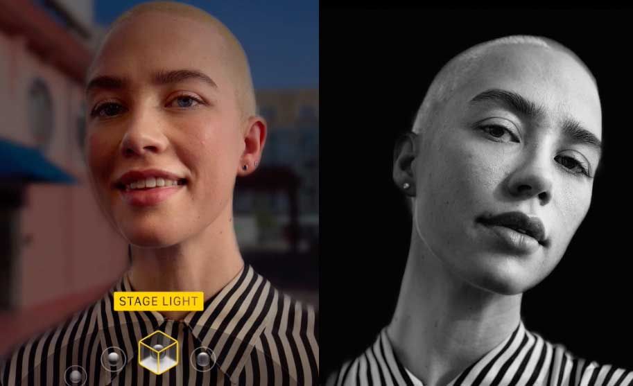
In one internship, I found myself tracing around hundreds of watches, to remove them from the background and prepare them for magazine layouts. Yes, joyful (and unpaid). But they looked great. A crisp outline, that would be really hard to reproduce. Apple’s portrait mode, released with the iPhone 7+, effectively replaced the (basic) design skill needed to select complex shapes. A few years later, ‘stage light mono’, an iteration of the same feature produces a result arguably better than most amateur photographers could pull off.
Example 2: Crop Suggestion, Apple Photos
Design skill replaced: Cropping
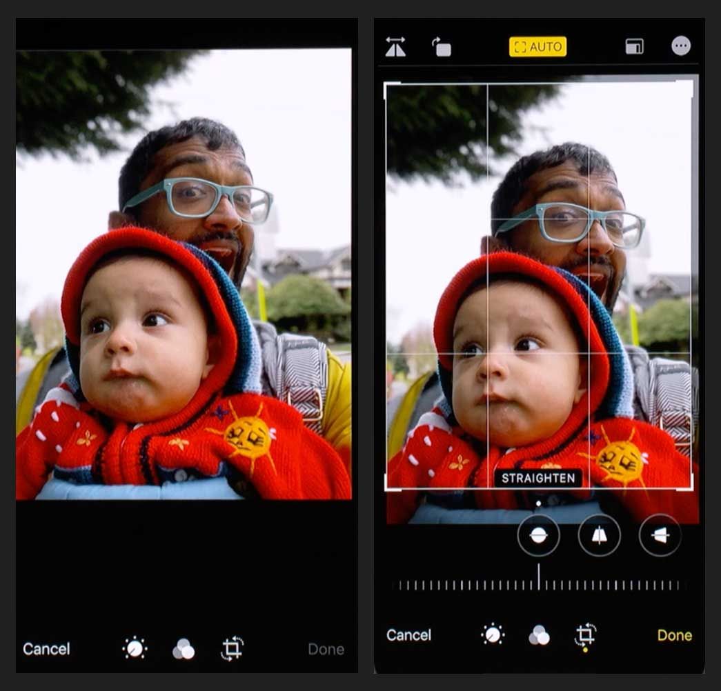
But they could never automate the creatives ‘eye’, could they? Machine learning is eating that too. Apple Photos uses machine learning to optimize your pictures. The product implementation is so subtle, it’s unlikely you’ve noticed this one. When you tap ‘crop’, Photos will automatically crop your photo for you, suggesting the perfect starting point.
Example 3: Automatic background color, Instagram
Design skill replaced: Colour theory
Post a landscape photo in Instagram, and the background will automatically match and complement the contents of the picture. At one point, I thought manually blurring rap videos would be my claim to fame. Now, millions of people get it for free. It’s a minor thing, but the app is making a design decision for you, and unlike Apple Photos, you can’t even override it.
As machine learning and other related technologies get better (every second), we’ll see more tiny design and creative decisions swallowed by automation.
Keep on your toes.
