The Imposter Quadrant
- I think I can do it + I did it (Low hanging fruit)
- Buy groceries
- Cook a nice meal
- I think I can do it + I didn’t do it (Growth opportunity)
- New skills
- Networking
- I don’t think I can do it + I didn’t do it (Big dreams)
- Live in another country
- Found a company
- I don’t think I can do it + I did it (Imposter Syndrome)
- New job
- Promotion
Don’t Unravel The Sweater
One way to think of types of advice:
- Doing more smart stuff.
- Being less stupid.
Today, I want to share a piece of advice given to me that falls into the second category. It’s something that I think is helpful when designers are tasked with talking about, or explaining their work.
I’ve been sharing work in a semi-formal environment for roughly 10 years. I’ve found this advice useful, and since I’m only just learning about it now, I imagine I still have a very long way to go, to become a coherent presenter.
The advice is simple, and comes with a nice visual metaphor.
It is: “Don’t unravel the sweater.”
Let me explain.
Also, I’m talking about designers involved with designing interfaces, flows, software, this might not apply for industrial designers, architects, other professions.
There comes a time in the design process, at many different points, where a designer needs to show their work.
You don’t just show the final product either. You are likely presenting to an audience unfamiliar to the project, so we typically spend a decent chunk of time sharing the context, outlining the problem that we set out to solve.
Think of that as the ‘before’, and the design as the ‘after’.
A big part of the design process is in that before bit. We are rolling around in the mud, deep in the weeds, in the trenches. Depending on how dedicated, and how big your research budget is, maybe literally!
So it’s understandable for a designer to get excited about the problem space. They want to share what they know. What they’ve found. Big problems. New problems. Hidden problems. Reframing problems. Slicing problems up into many tiny little mini problems.
An umbrella, designed to shade someone from the hot New Mexican sun, now has solar panels, to power a fridge, that chills a drink…
Exciting for the presenter. Disorientating for the viewer.
This designer has made the grave mistake of tugging at some new threads.
By the end of the presentation, there’s just a pile of wool, and a designer saying here, look at this glorious mess!.
Don’t unravel the sweater. Stay on topic, explain the problem, show your solution. Leave the sweater alone.
Product launches, decoded

Tech company newsrooms are one of the best places to learn about product. Once you get past some of the marketing language, you get to hear about the key problems their users are facing, and how they have built solutions to help.
I’ve read through three recent product launches from Uber, Spotify and Twitter and extracted the key problems and features they have shipped against them. For simplicity, I’ve used a basic hypothesis / prediction model.
Of course, in reality there are far more inputs than user behavior, but it’s a fun exercise, and the problems can provide inspiration for your own side projects. For example, the fact that twitter relies on public sharing, yet sharing things publicly is inherently intimidating, is an awesome insight to riff on.
What they shipped…
Uber - Making pickups more seamless, Feb 27, 2019
Hypothesis: For a seamless pickup, we believe it’s important for riders and drivers to clearly communicate with each other. We’ve noticed that for drivers whose primary language isn’t English, and for riders who are traveling abroad, language can impact how you communicate on the app.
Prediction: If we provide a translation tool, that helps a rider or driver instantly translate a message into their preferred language, it will be easier to stay in touch as your ride is en route or arriving.
Spotify - Helping users access and navigate music more easily, Feb 27, 2019
Hypothesis: We believe many users navigate Spotify with one hand. Depending on the size of your device, it can be uncomfortable to access different actions like play/download with one hand.
Prediction: If we group key actions (like play/download) in a row at the central part of the screen, it will be more comfortable to use and play music on Spotify.
Hypothesis: We believe one of the barriers to easy music navigation, is the time it takes to recognize the song/artist title. It’s tough to quickly find the song you liked in playlist with 200+ songs.
Prediction: If we include cover art in the track row, it will make it easier to navigate the app and find familiar songs.
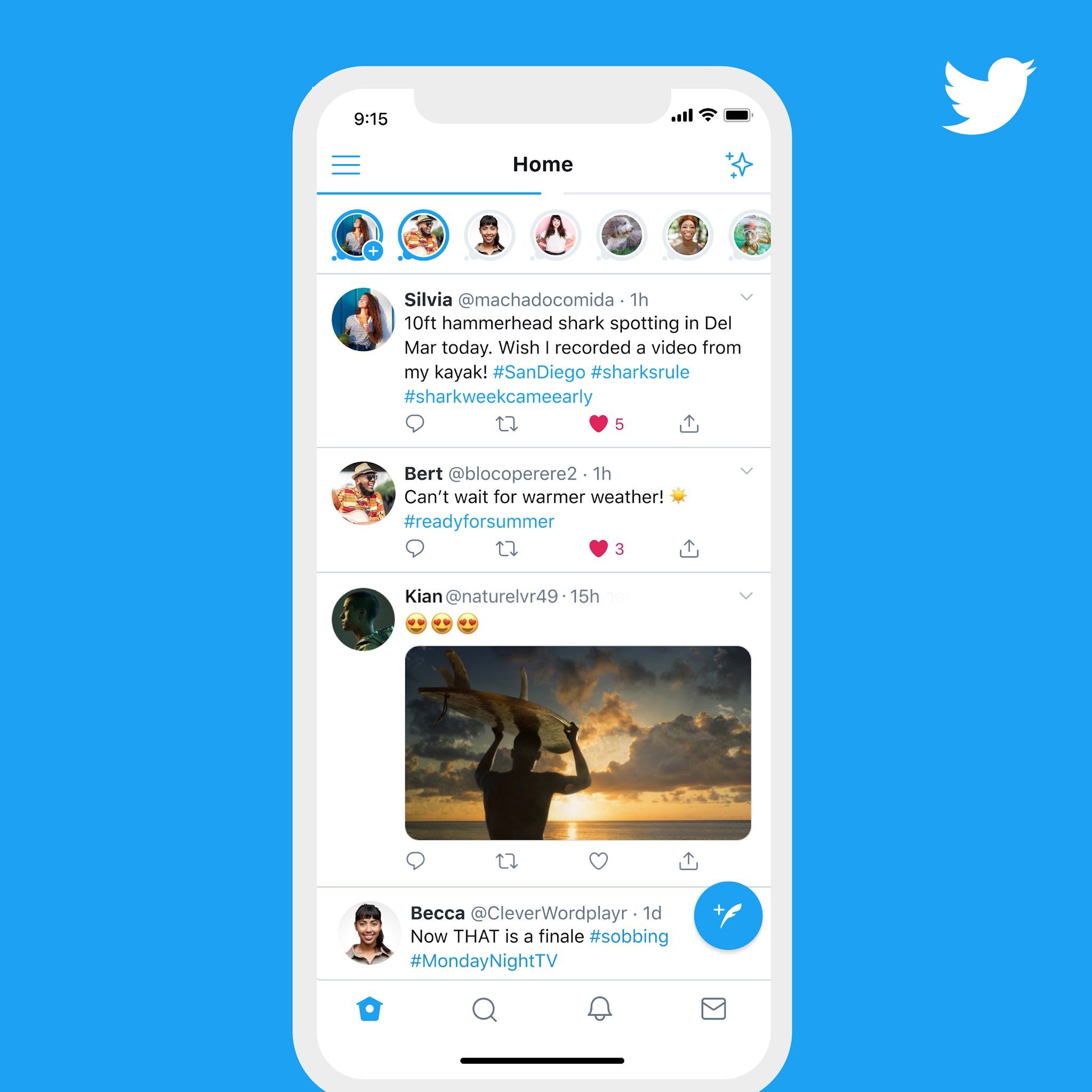
Twitter - Help people share thoughts publicly, March 4, 2019
Hypothesis: Tweeting can feel intimidating because tweets can be seen and replied to by anyone, and there’s a performative element (how many likes/retweets this will get.) We believe this anxiety holds users back from talking on twitter.
Prediction: If we let users share ‘fleets’ that disappear after 24 hours and can’t receive likes, retweets or replies, users will feel less anxious and share fleeting thoughts that they would have been unlikely to tweet.
So, next time you see a press release, don’t roll your eyes, read it closely and think about the decisions/tradeoffs behind every new feature or design iteration.


