Nonrational Packaging Design in the 1950′s
Notes from The Hidden Persuaders - Vance Packard (1957).
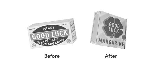
Good Luck Margarine
While a competitor can often successfully imitate your product as to ingredients and claims of quality, a vivid personality image brand is much more difficult to imitate and so can be a more trustworthy sales factor. A fairly simple, straightforward use of non-rational symbolism in image building was Louis Cheskin’s transformation of the Good Luck margarine package. The package originally contained several elements, including a picture of the margarine. In one corner was a little four-leaf clover. Mr. Cheskin found in his depth probing user research that the four-leaf clover was “a wonderful image” so in three successive changes iterations he brought it more and more prominence until finally he had a simple foil package completely dominated by a large three dimensional four-leaf clover. Mr. Cheskin reports that sales kpi’s rose with each change.
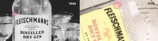
Fleischmann’s Gin
Fleischmann’s Gin, in seeking to cope with the sexual revolution, turned to Louis Cheskin for guidance. He suggested a slight change in the label design which probably wasn’t even noticed by the average buyer but which, he claims, distinctly modified its sex appeal and brought a great increase in business for the company. The old label was a plain rectangle with sharp right-angle corners. Mr Cheskin merely rounded the corners, which reportedly made the label more feminine.
In these examples, the insights (pop psychology + a fair whack of 50′s sexism) and data (Mr. Cheskins trusty ‘reports’) are shaky.
But the thinking is in the right direction. With each update to the design, he’s building the brand. Making it more distinctive, memorable and differentiated from competitors.