mubi.com

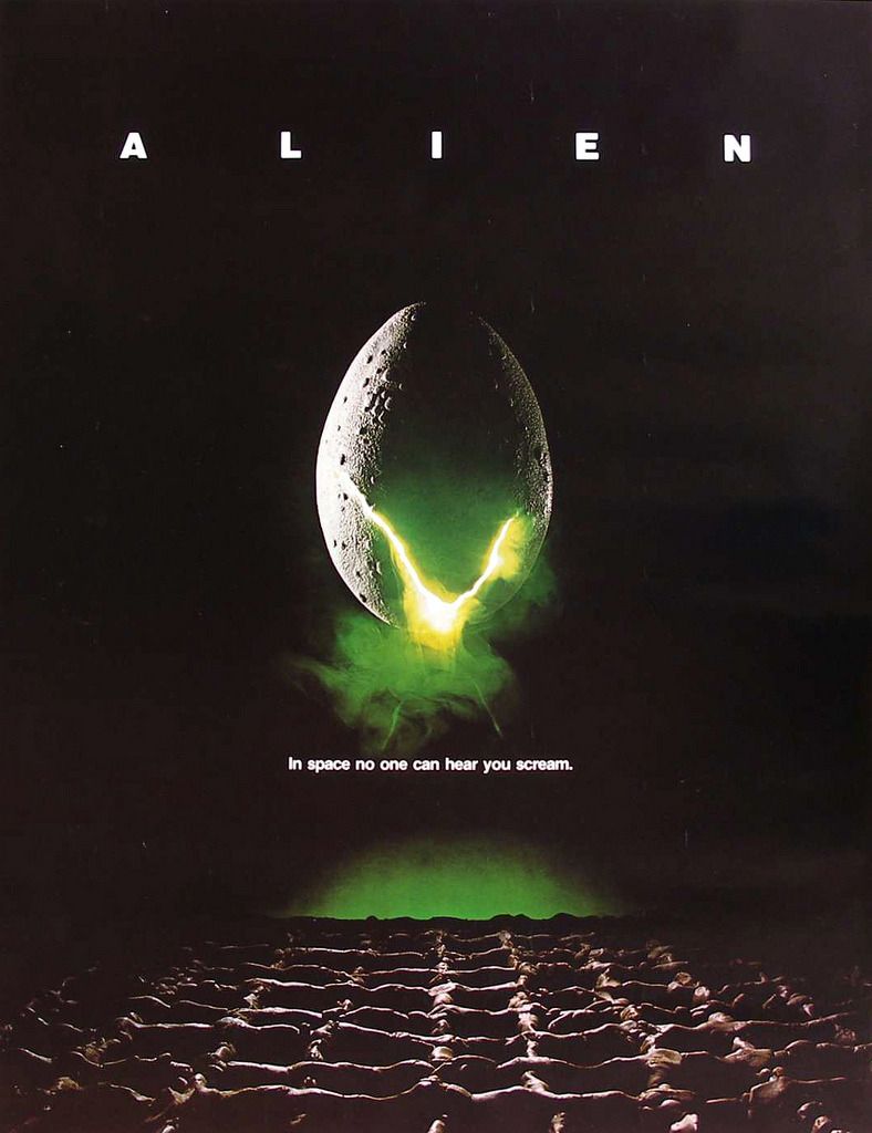
“Steven Frankfurt (creative director of Y&R 65-72) was a brilliant designer as well as a great ideas man, and his most innovative marketing concept, starting with Rosemary’s Baby in 1968, was to see the packaging of movies as a totality—designing the titles, posters, trailers and ads with one common look and theme. He also made a specialty of taglines (“Pray for Rosemary’s Baby”, “In space no one can hear you scream”.”
How many creative directors still design movie posters, albeit ones as iconic as this? I can’t think of any. This seems to be as close as you get these days: digital creatives playing around with little ideas, and using their weight to spread them across the internet. Having a strong design background as a creative director really isn’t necessary any more, but it happens (I think Nick Law of Nike + fame spent 5 years as a designer which might explain the beautiful UI of +).
But seriously look at this fucking poster, it does everything a film poster should do and then some. And that tagline!! Consistency in film branding is definitly still underrated, and you can’t say it’s not effective. Blue: Avatar anyone?