Ministry of Design

It’s that time of year again. The nights are no longer bitter and cold. The sun is out and metros can comfortably strut the streets in ridiculously deep v-neck t-shirts. They may stop and admire the colourful poster on the street promoting the new annual. They might say ‘yeah i’ll buy that for sure’. And they probably will.
But how have times changed in the design world? Let’s have a look.
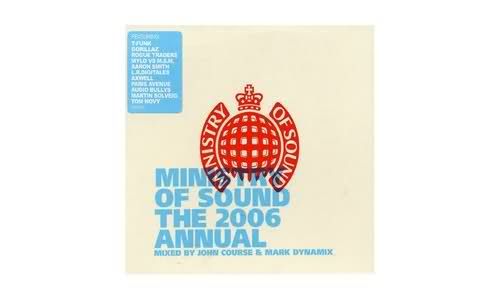
2006 in my opinion is probably the most understated of all 5, if not a little bland. Non offensive two colour over print. It was a simpler time, before electronic music was on Nova all the time.
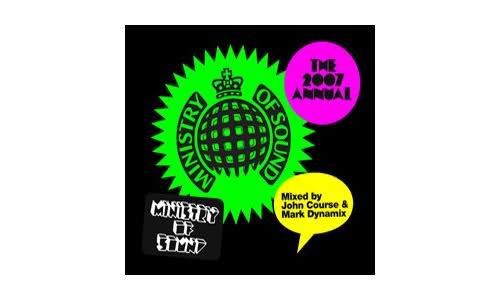
2007 was the year things started getting out of control. Zany holding shapes, grating fluro colours and reckless font use. The one thing I do like is the fat type used for the title (the N’s in particular), but that’s about it. At the time surf culture (read advertisements) was flogging speech bubbles and hand drawn 3D letters, so I guess there’s your influence.
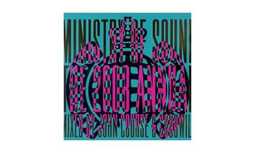
By 2008 the metro crisis had reached breaking point. Every second kid on the block was cutting themselves a fresh trendy mullet and donning the bright aqua tee. The cover reflects this. It’s loud. The type they’ve used is so long and thin, that there’s no possible way it hasn’t been stretched/raped. I don’t know a lot about the typography as an art form, but I’ve been told many times not to f***ing stretch it! The over-print thing could of created a nice eye trick but there’s no execution, it’s simply a mess.
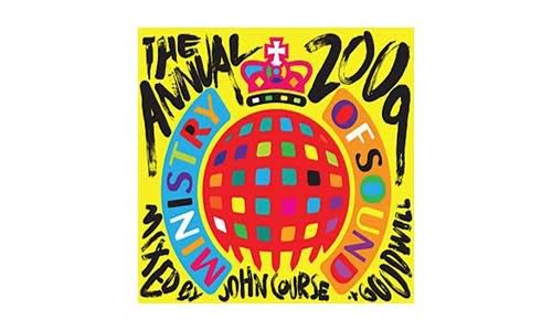
2009 was actually designed by John Zawada. With a distinct lack of ‘bangers’ on its tracklisting, the colours move back to a playful primary set, and it’s good to see some hand lettered titles for a change. The main objective for these covers is to stand out, and I remember seeing it at JB; the hot yellow caught my eye pretty much straight away.
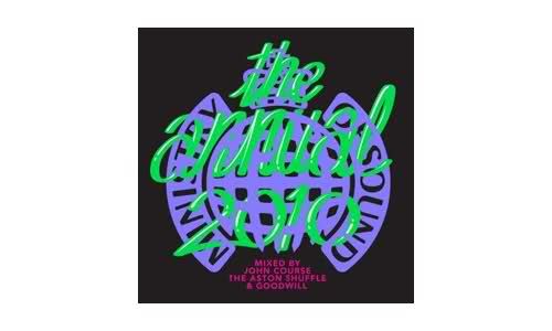
I haven’t really made up my mind on 2010, which was released the other day. I like the faux reflections on the type, a look that Alex Trochut has been pimping for a while now. It’s a cheap little trick that makes the letters push out a bit more. However, the colours seem a little odd, the black background just reminds me of the 2007 train wreck, and it just looks a little dated, without anything obvious enough to say ‘retro’ or a particular decade of music. It’s lost.
It’s got to have the big ministry logo, be eye catching, and say ‘the annual’ on it. There’s only so much you can do with that.