Is Hipmunk deceiving users with dark patterns?
Hi Hipmunk, I know I’m not the first designer to pick holes in your website, but I’m not trying to be original, just thinking out loud.
Let’s log in.
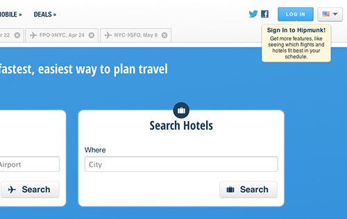
Over in the top right corner is a log in button, which seems like the right place to be heading.
If the phrases ‘log in’ and ‘sign in’ are interchangeable, why use both?
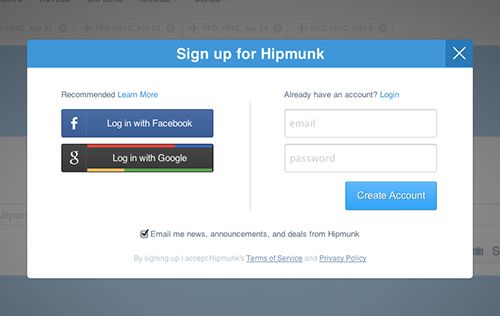
I click ‘log in’, and get this screen. Hipmunk recommends logging in with either Facebook or Google because it’s ‘one less password’, but if you want to use your email instead, the header and the button are saying ‘sign up’, and ‘create account’ which is wrong. It’s so slight, that I enter my email anyway and get an error because it’s ‘already in use’. I work out what’s going on, and after clicking the tiny blue ‘Login’ (one word now?) the screen quickly changes.
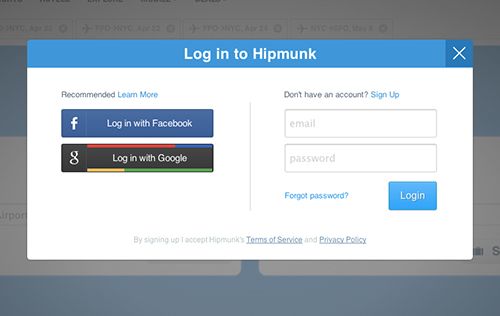
Why didn’t I get this straight away? Logging in is the primary action, like it said on the box. Is this just what happens when you test and optimize the hell out of your product? It’s not logical, but it gets more signups?
I wouldn’t classify this as a dark pattern (like my linkbait title suggests), but it’s confusing and a bad experience for users, on an otherwise very likeable, easy to use website.