impawards.com

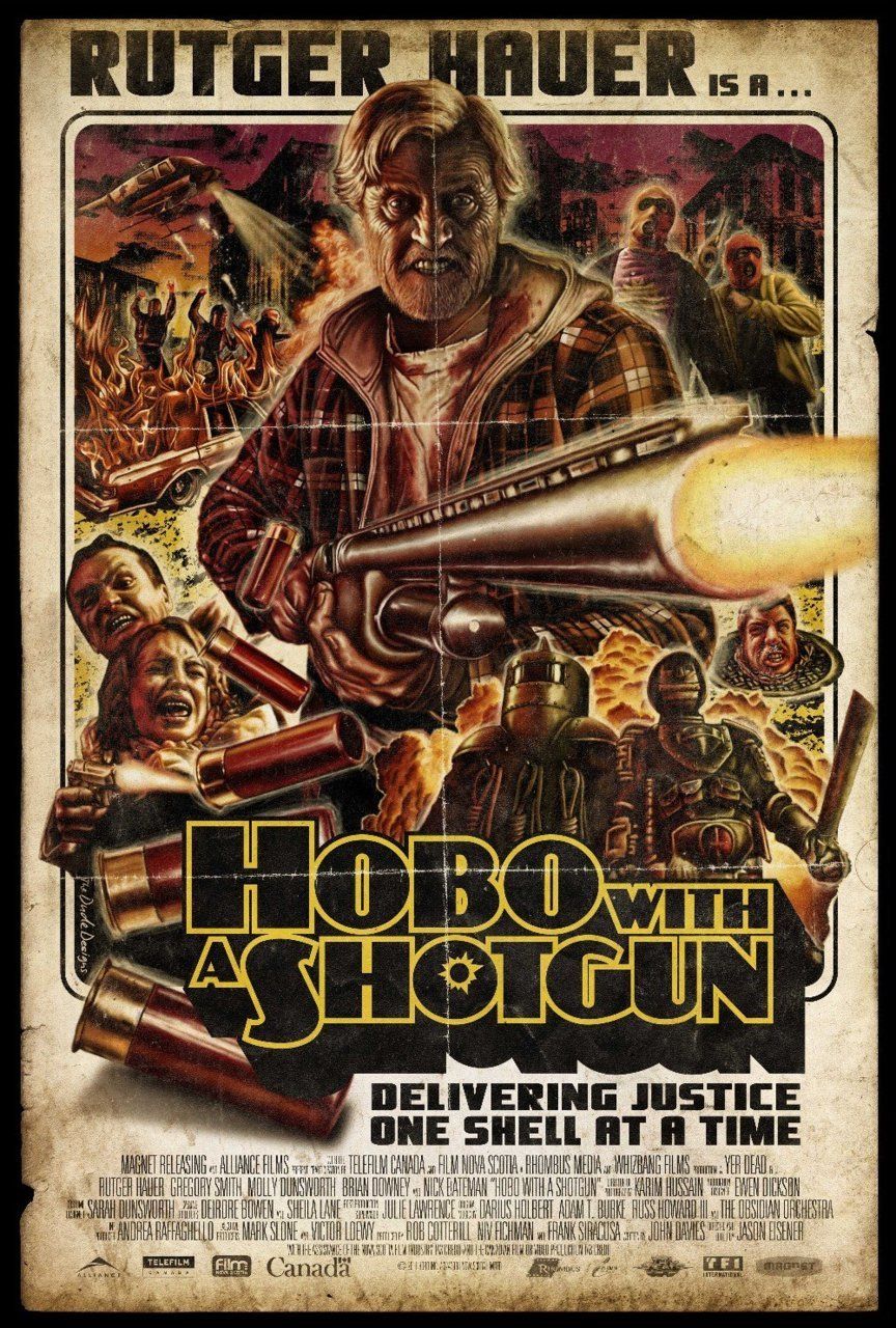
Hobo with a shotgun designed by the dude.
Edit: The more I look at this poster, the more I dislike it, the illustration is alright, but there seems to be this choppy photoshop effect (emboss?) on everything, and he’s done a bit of a mess cutting out some of the characters..I’m not sold on the font either, it’s Koloss, a 20’s deco face and I don’t think it works as well as Aachen, used in Machete.
Check out Yves’ full May poster review here.
The fact is, any film with the tagline ‘delivering justice one shell at a time’ is a film I’d like to see, no matter what the poster looks like.