hofstede.com.au

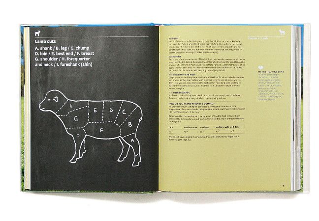
Some sturdy old editorial design by Hofstede Design. What’s up guys?
I bought a copy of Esquire (UK) today and was soaking it in on the train. I try and buy the American one; it looks and reads different. With the english version it’s way more pared back, more reserved and there’s no wild free wheeling essays; I read an article (U.S) once where the journalist tried writing on a subject sober, and then drunk, and someone reviewed and rated his attempts…
I did like the fact that the British version uses a large amount of editorial illustrations, not just for aesthetics but as functional diagrams and for visualising articles.