Geoff Rowley
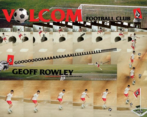
At 7:30 pm, almost 7 years ago, I downloaded this image off Volcom’s homepage.
Why I downloaded it, I’m not exactly sure. There’s two reasons. 1: I liked the look of it as a desktop background and/or 2: I needed ‘inspiration’ for a school project. At the time I was studying the second unit of Visual Communication at High School, so artistic reference would have been something in high demand.
What I can remember: The image was found in the ‘media’ section of the Volcom website. I’m pretty sure this design was briefed in with the sole purpose of plastering Volcom logos on thousands of teenagers’ desktop wallpapers.
Their black and white logo was already a familiar face to me; scribbled in the back of exercise books by my peers and I, not because we all skated (a few of us did), but because it was easy to draw and looked cooler than bombing your own name.
Skateboarding was a huge way to forge teenage identity, and although a company logo like Volcom’s says a hell of a lot about who you are, nothing was (and in some cases still is) as powerful as a photograph. The exotic locations of Southern Californian backwater towns and unattainable swag; tight jeans that were still years off the mainstream market.
The photo was king. In magazines like Slam or Thrasher they usually ran good ones at full bleed; well light, urban stair scenes warped into hyper-real visions, the ever present distorted fish eye lens.
It took me until somewhere near graduation to email the editor of Slam magazine, naively asking him how to achieve a photo that looked that special, skateboard magazine way. This thirst for a certain photographic aesthetic would quickly giveway to night-party photography, especially the now defunct Streetparty parties.
Date unknown. (should find this out). Emulating the flash/long exposure style of certain party photographers.
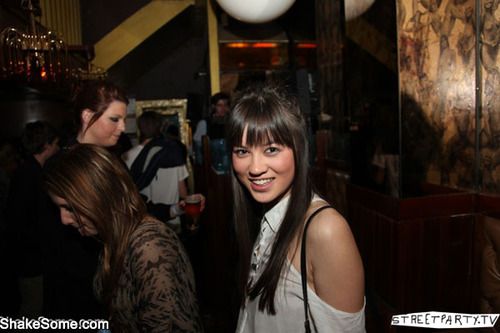
Here you can see my ‘inspiration’ for my own watermark; for whatever reason I was obsessed with that crudely drawn Streetparty logo…
The image here isn’t static though, it’s an image sequence. A collage is really not the quickest, easiest nor most efficient way to show Rowley performing a flip trick (a 5 second video clip is), but it sure looks cool. Back then, collage was graphic design. It was what was popular ergo, everything else was boring and not worth designing.
It was easy enough to use the pen tool and scrap together objects, the problem was the ‘open brief’ theory, where your brain is swamped with just too many damn options. The designer here has shown restraint; Exaggerating the art direction of the photo shoot with a few cheeky objects sprayed across the spread: an in house designer’s wet dream.
Lastly, I was shocked to recognise the typeface choice. Back then, I probably could have told you that it looked ‘different’, and that it would have played a minor role in the reasons my brain made the split second choice: yep, click, download. But I really couldn’t have told you anything about the typeface, I simply couldn’t see it.
It wasn’t until about 4 years later, during my second year of University, that I properly noticed and identified the typeface. I interviewed an artist for our school magazine that I was art directing, and while researching for the article, I saw a piece of his that I loved.
Haylock, Brad. Crazed and Defused. 2008. The Narrows, Melbourne.
The font was Friz Quadrata. I didn’t think much of it, until a year and a few more hundred beers and coffees later when I recalled it for my graduation poster.
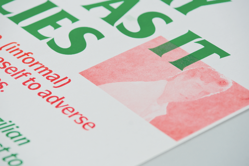
The aforementiend poster: A series of 4, A3 risographs that documented slang words and phrases that friends had invented.
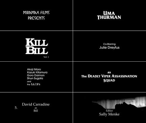
Coincendece? Probably. Maybe Brad had been indirectly influenced by Volcom’s marketing team like me, or maybe he’d come across Friz earlier, say 2003 at the theatrical release of Kill Bill.
I guess this is how we work as designers, constantly drawing upon memories, things that ‘like’ or might use someday. That might be why people find it hard to talk about their design work: so many of the choices they made that led towards the finished product were entirely subconcious and driven by years and years of looking at and thinking about things.