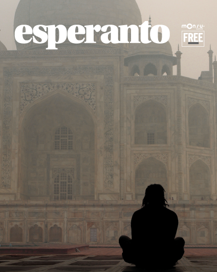
esperanto news
The Travel Issue.

150 links,
44 pages
20 paragraph styles
Drop caps, paragraph dividers, proper magazine sections, better/larger photos, our the first multi spread feature etc simply more of a real magazine.
My only regret is making the cutoff too late. It seems that Caulfieldians like dropping their articles on the deadline, leaving me with 3 days to design (or to ignore) their stuff.
Sooo next issue:

gen y looking back at the 1990’s
Next issue i’m going all out-ill be designing in the holidays so i wont have school projects to fuck me over. full cd reviews section, better ads, spot colours on the cover, and heaps of colour thorughtout! you may of noticed that i try and not use much colour. We’re getting a guest editor in, and I want to get a guest art director to design a few spreads. heaps of throwback 90’s american design. crazy patterns, duotones, way more type treatments, spot illustrations etc.
90’s is tricky to pick a style-you could go shoegazey, or grungey black and white. I’m thinking of the more jungle rave with lot’s of references to being a kid in the 90’s cos most of us were. That means lot’s of patterns-sports, games, books and toys as reference objects.
Should be a banger-Hoping to get a bunch of deejays to mix up a few 90’s mixtapes, and I’ll compile it into a 1 hour megamix.
Also thinking of a Powerranger v Captain Planet Terry richardson style cover shoot!!
check out www.bloggerbeware.com and the ‘early 90’s culture references’ at the bottom of the page for ideas!