Diffs
Sometimes it’s easy to see why a product is moving in a certain direction. Maybe it’s a brand redesign or a strategic response to a competitor - or these days COVID. Or it could be a simple fix for something that is frustrating users, a little bit of confusion, a little too many support requests.
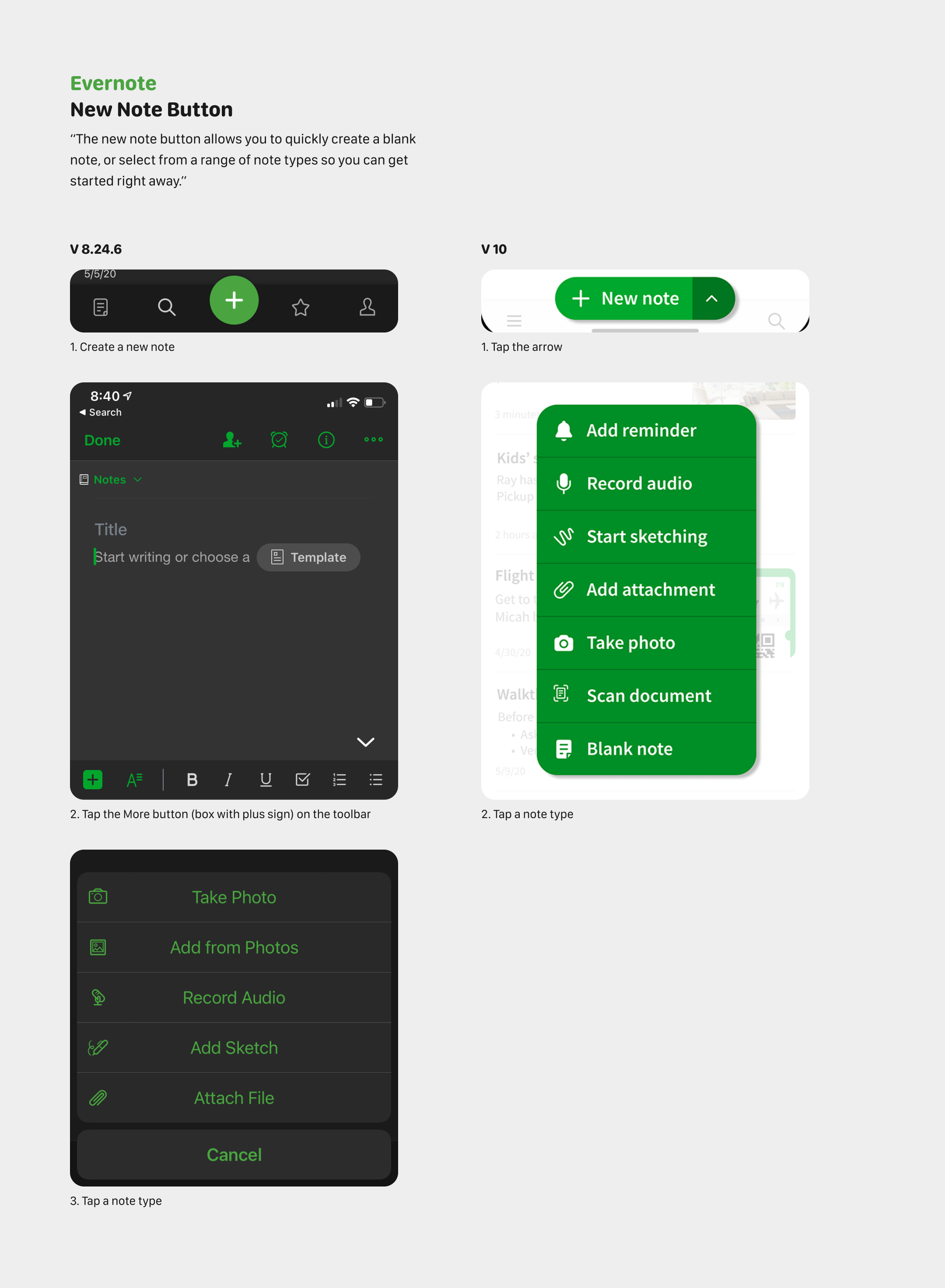
I’d like to see ‘diffs’, the before and after of new features.
As an example, a sort of proof of concept, I’ve put together a side by side from a new, rather major update from Evernote - thank god they shipped something!
I’m not sure what the best format would be. Maybe a gif, or the NYT slidey thing?
Within the new release, which included several changes, I focused on the update to the new note button. It caught my attention because we had a similar interaction for myfitnesspal, a big plus button that opened up a secondary menu. I thought this was an interesting solution. Text lablel and more physical space for the note button, but also allow users to jump straight to other note types with one tap.