concrete.ca

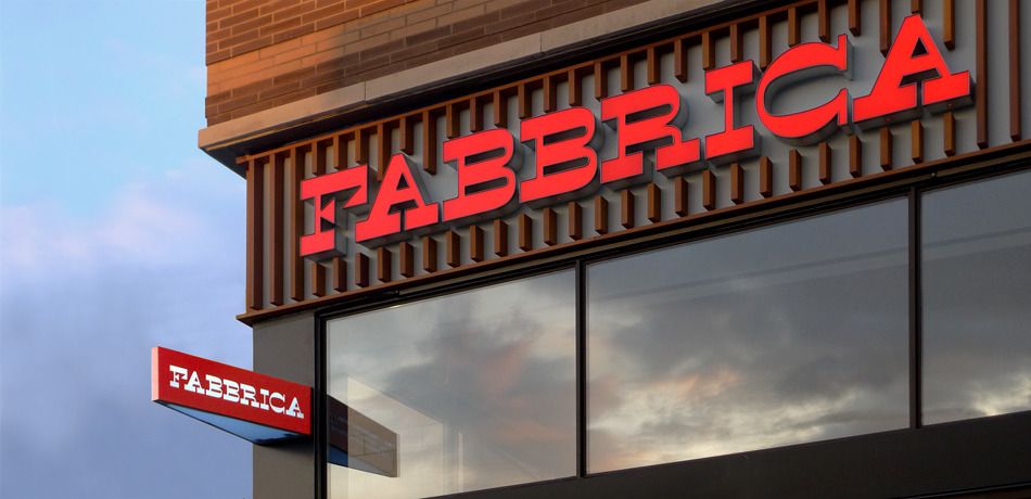
Although it’s not Lonestar, it’s a very similar style, and a striking Canadian identity. (Trend alert!). How would you describe this typographically? Extended slab serif? I love that horse shoe C, classy..
The work was done by Concrete Design Communications.