92436965527

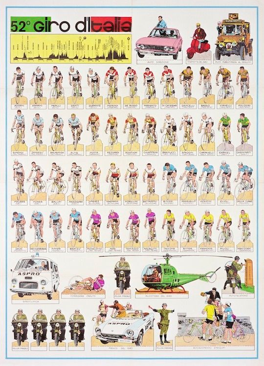
“The dotted lines around each rider/character suggest it was some kind of pull-out poster for children (or nostalgic road-racing fans).” - Rapha
Arguably this is an infographic, but when you say that in 2014 all I think of is the stereotypical.
This poster was made before that word existed (i think), and is mainly illustrations. That’s why I like it. It’s accessible because it looks as if you could assemble it into some sort of game on your kitchen table. Plus, it communicates a truthful picture of any big cycling event (just lots of guys on bikes, and other guys shouting and chasing them around in cars).
Other stuff that could use this art direction: Rambo: First Blood, The Olympics, The Middle East, Oliver Twist