91938992452
The graphic design of Gambling. It sounds like a book by Steven Heller, the only guy who writes books about topics like that. But it’s not, in fact hardly anything exists on the subject.
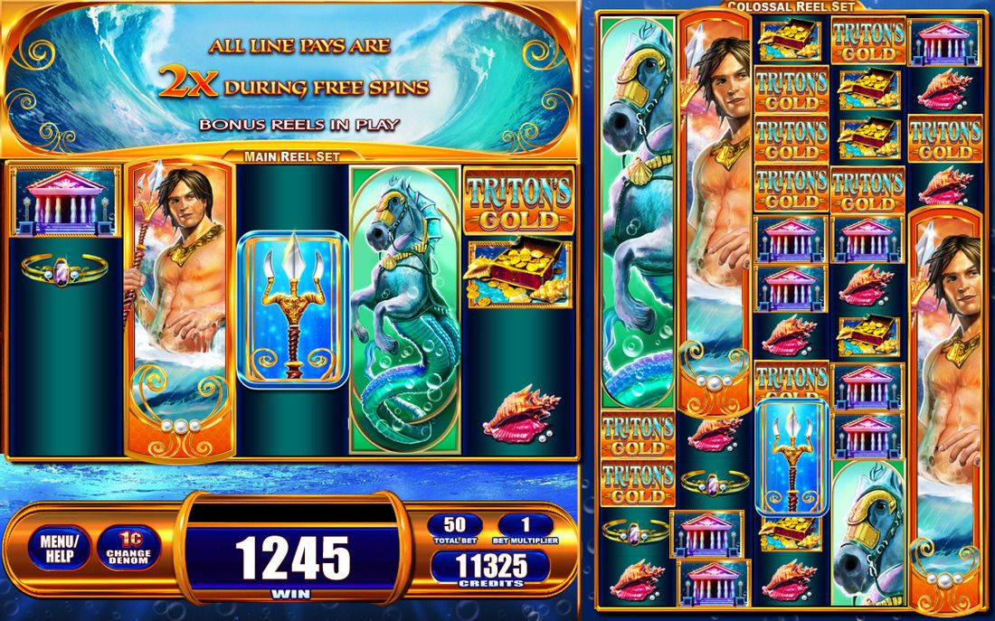
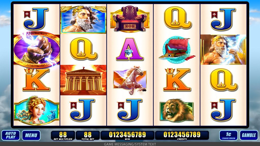
Touch interfaces that people spend not minutes, but hours_,_ or _entire days_using. The concept of slot machines is unpleasant to me, and the imagery they use mirrors the casino environment; bright, garish, fake, but powerfully alluring. Simple fruit icons (that existed because the machine spat out chewing gum winnings), have now (i think) been largely replaced by a fantastical 3D world of Ancient Greeks & (ironically?) Native American Indians.
I’d like to talk to the designers and visual artists. How much has been already decided? What data do they use? Do they know what works? Does Zeus and the ancient Greeks test well? Does a gold interface retain attention longer than platinum or bronze? What about the users? Do they even think about the visuals? I’d guess that the eye candy is there as a distraction, a gel that covers their complex battle of chance with the machine. ‘It’s pretty… I don’t know, I just want to win big!’