80437095521
What happens when you finish reading? Here’s a few examples from some magaziney-type websites.
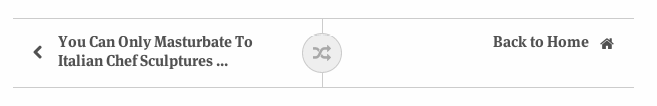
The Onion has some of the funniest writing on the internet, and since all the articles are fairly random, a shuffle button is a natural fit for the brand, and appealing to bored, directionless readers.
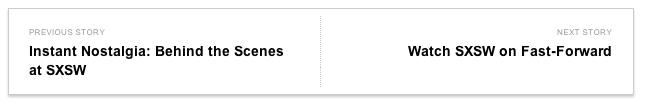
Esquire has a card with two options, previous and next. The linear journey is a false construct, as you’re on a website rather than reading print, but maybe that’s the point: gently nudge readers along a path through (hopefully) a 5-10 min chunk of content (and ads). The Onion also served up three ‘related’ articles for a bit more choice.
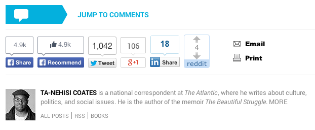
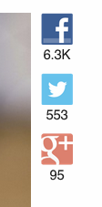
Lastly, the Atlantic (is it low-brow or smart? I can’t work it out), is rightly a mess. Personally, I like when publications give the author a little context, and I’ll often check out their book (or at least read a review) if I enjoyed the article. However, it’s taking up too much space here, and if you’ve seen him once, you probably don’t care that he’s a ‘national corespondent’ anymore; a link to a bio would be enough. As for the rest - I’m over here cheering for the Onion again: no comments, and subtle, custom social buttons floating quietly outside the content area.
Classy.
The Atlantic decided against this approach as ‘not strong enough’ and unleashed a double facebook assault on their readership.