714009027

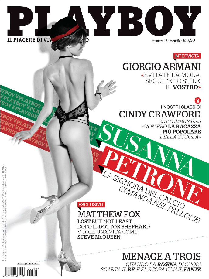
Banners are ‘now’ in a big way. I could dig up maybe 20 recent examples of them in use but im at a cafe and the internet is treacherously slow. Just take my word for it.
For the design of Esperanto V.4 (the 90’s edition) I was all set to design it like David Carson took to Raygun in the early 90’s. I did my homework, read the books, worked out what fonts he used, how he treated type-but when I actually got down to doing it myself, I couldn’t. It’s like if you’re good at backstroke suddenly forcing yourself to swim breastroke (that you hate, not that good at, and don’t think it looks particularly good). So I apologise. Esperanto 4 won’t be grunged up and have ridiculous letterspacing and a thousand different fonts on one page. Because that ‘postmodern’ graphic design (~’88-’99) was basically a failure and i think a response to the pc getting introduced in the mid 90’s. Design went to far. It was all about the limits of legibility, and imho i dont think thats what (good) editorial design is about.
but There will be lots of banners, and more illustrations throughout. And just to make it a bit harder for myself i’m only using one colour (a soft red), and of course black, so the Cyan ink won’t be used in the print. A really vivid spot red will be used on the cover. that with a lot of different weights of h&fj’s knockout, the design is starting to look really constructivist. Think El Lissitsky, lightly referencing russian propaghanda posters.