664990779

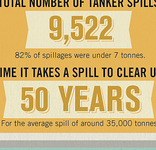
Can we stop with the senseless drop shadowing of trade gothic-y style fonts? I’m blaming Wired, Good, and americans in general for this trend. (It does look rather nice though). Condensed fonts like Garage Gothic, Trade Gothic, Montefiore and Knockout are kind of a big deal still.