539828825

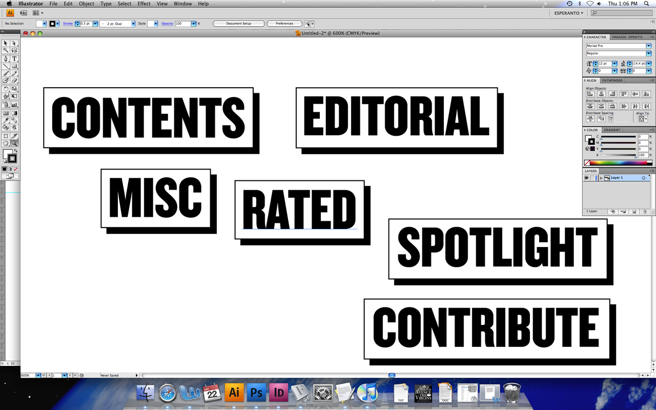
When I start out doing the layout, I’ll spend heaps of time on the first article. New grids, style guides, photography style etc, because as more articles come in, that first layout will be the basis to their designs. My ‘Header’ font which changes each issue will be Caslon Graphique, a font popular in the 70’s, but unlike Octopuss (the last feature font), it has a little class! You’ll probably recognize it from Readings. The design will be quite a bit more reserved and classy, and way more focus on photography and injecting a bit more white space into the page. For the sections or ‘regulars’, i’’l have an actuall system which will tie them together and pull readers through the book. A little box that will hang off the top margin, rather than invade the space of the page beneath it…