37626588588

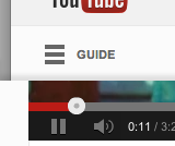
Youtube gets a good dose of Google’s new inhouse design aesthetic.
It looks a little stark but is inline with the ‘death of gradients’ and a move towards flatter graphics in digital work. That three lined icon is the ‘hamburger’ and is fast becoming the standard for hidden menus or lists. You’ll usually see it most on mobiles.