364517816
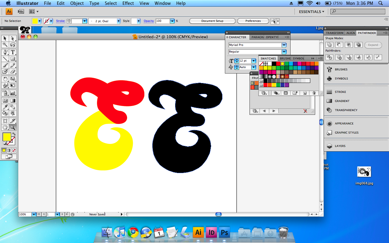
Working on a new logo for Esperanto, my school magazine. I played around with a few different type treatments, was thinking of using bauer bodoni cos it’s pretty cool at the moment.
example 1

example 2
I started thinking how about just E? My editor might not be happy with it but i think it looks quite refreshing. I want it to be completely flexible like Aol or NYC (both created by Wolff Olins) and generally hated on by most people. So it can be a flat colour, or a two colour so you can see the hidden e (i dont like this version as much), or even as a darker cut of the photo it sits over… id want it more of a mask than a logo. but i want it to be more a logo than a masthead. hear me?