224245414


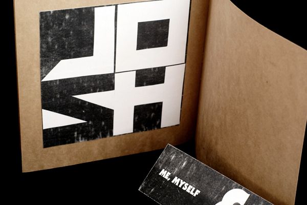
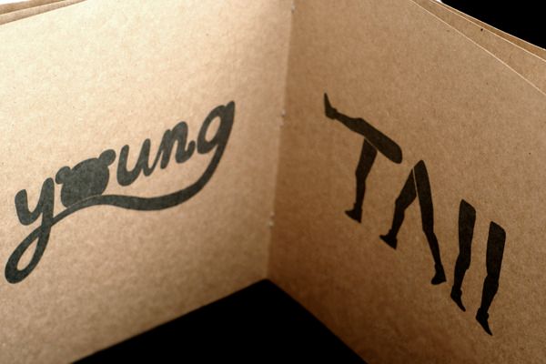
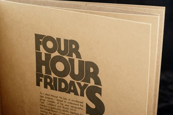
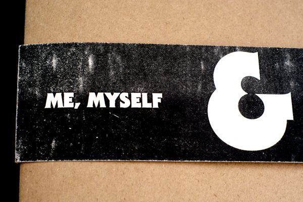
To wrap up Typography this Semester, we had to design a booklet that held all our little class projects in. I tried for a kind of raw look, all the colour and texture is from the photocopy toner, and the stock is cheap kraft paper. I know that black on recycled paper is kind of used up, but hey it’s simple, cheap, and still looks alright.
In other, much more important news, I got some link love this morning from Australian ID blog Design Droplets, who have just turned 1 year old, happy birthday guys!