19 seconds of WWDC 2022
Apple is famous for their presentations. Steve took the art form to new levels in the 00’s. Today, it’s even more finely tuned, despite lacking some of that original creativity and magic.
I’m going to look a bit closer at one particular clip from the recent WWDC 2022, 19 seconds to be exact, that introduces a new way to access spotlight search on iOS.
Here’s the clip. What caught my eye were the smooth, subtle and frequent transitions. There’s nothing flashy, and it’s all certainly achievable in Keynote. But what’s impressive is how much they communicate in such a small amount of time.
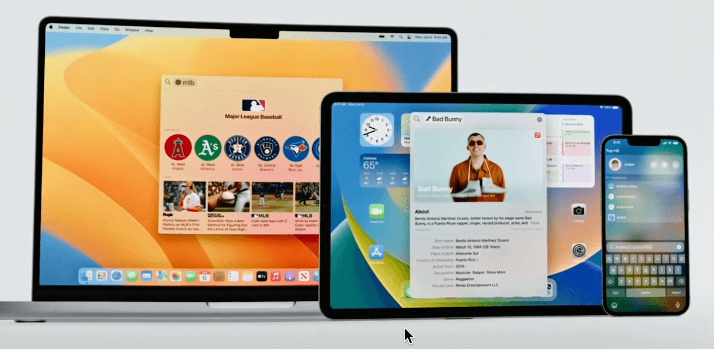 “Rich results and the ability to take actions right from spotlight are also coming to iOS and iPad OS”
Craig is setting up to talk about searching for stuff on iOS. We are zoomed out and we are looking at how spotlight spans across all platforms.
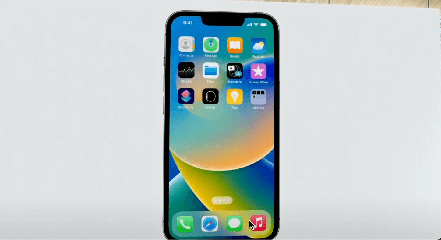 “Speaking of iOS we wanted to make spotlight even easier to discover and access.”
Now we are focused on the iPhone/iOS. Specifically, we are looking at a Home Screen, where the new feature is located. Craig is implying the customer problem. You don’t always need to say ‘customers were failing to find this feature’ or ‘feature x usage has really plummeted’. Apple would rather say ‘we wanted to make X better’.
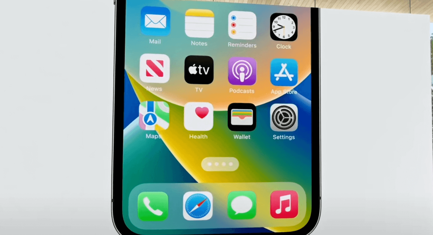 “So we added it right to the bottom of the Home Screen.”
Boom. This is the solution. We don’t know exactly how it works yet, but this is the primary design update. We are also zoomed into the area of interest (lower third).
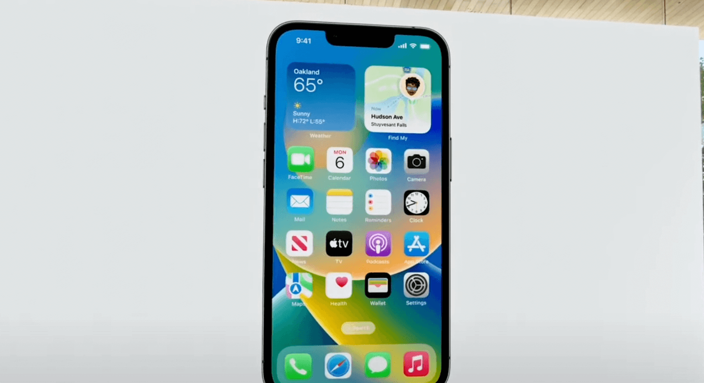
We zoom back out to show how this feature fits into the entire Home Screen. Spotlight search seems to replace the page dots on the home screen.
What is not shown, is when you swipe onto other app pages. The page dots appear briefly before switching back to the search button. Craig doesn’t have time to go into that level of detail, and shouldn’t need to.
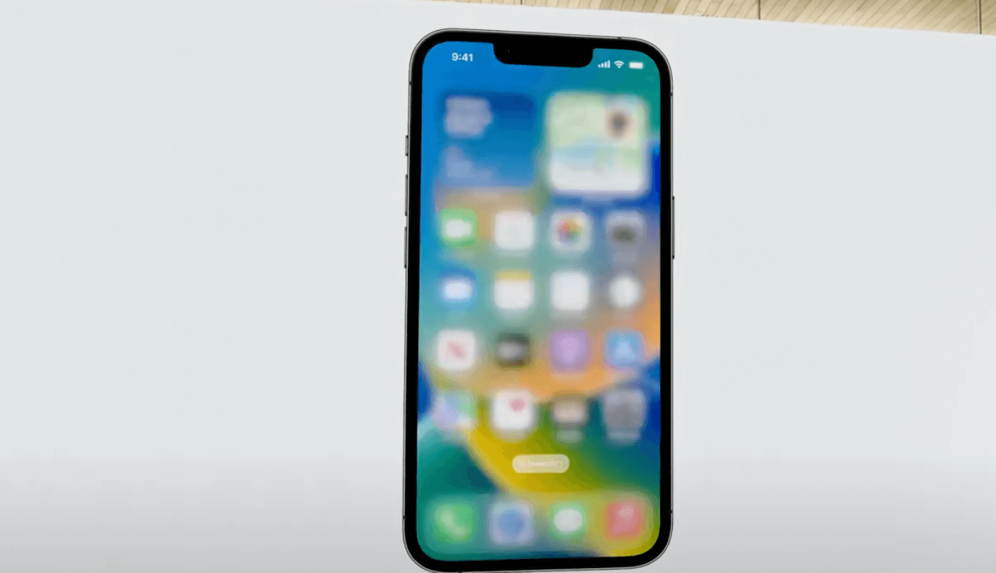 “With just a tap, you can use Spotlight to launch an app…”
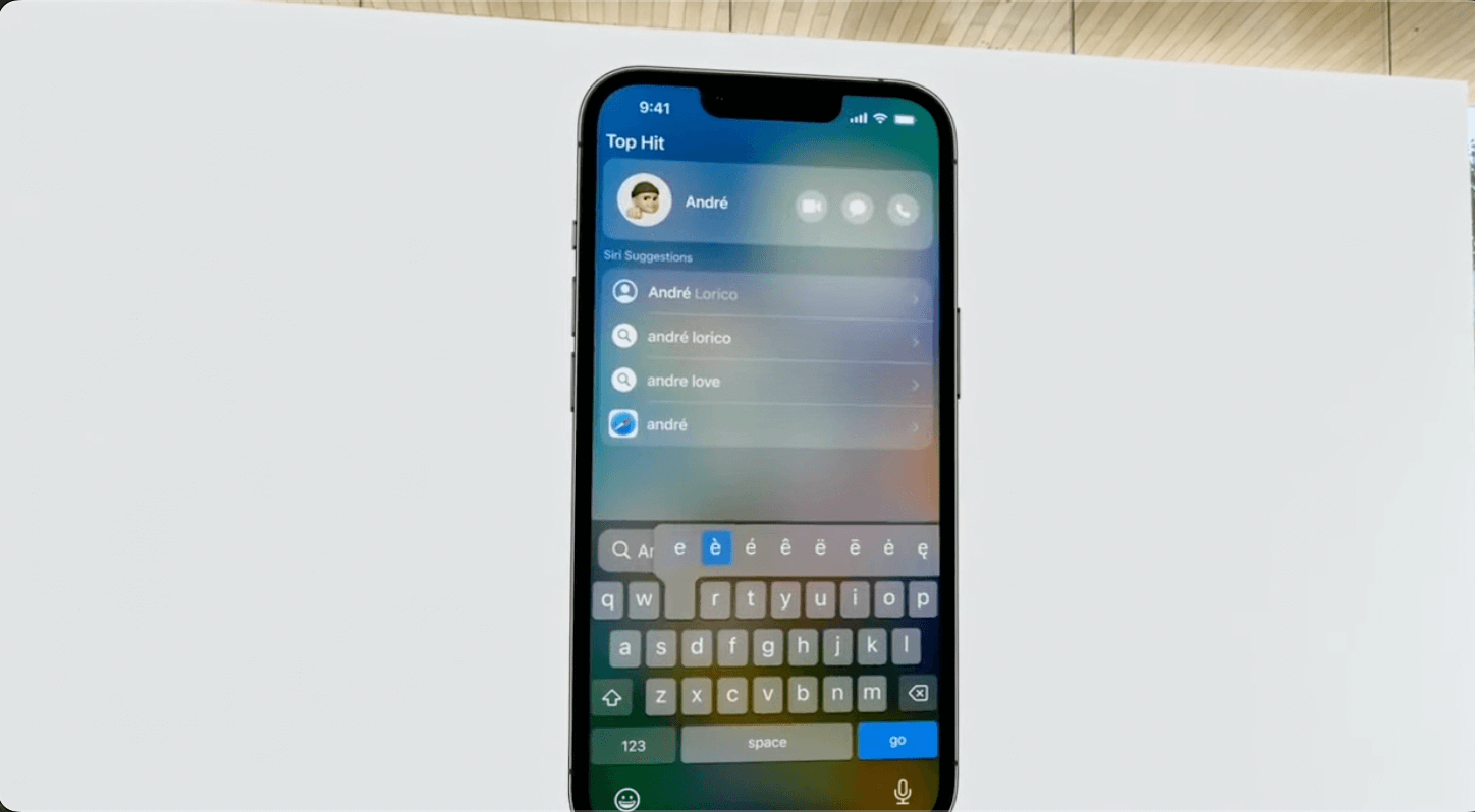 “Find a contact, or start a search…”
One of the best ways to explain something is show it in action. Common use cases can help bring your audience along. In this example, he’s showing a contact lookup but could easily have been finding an app, searching for an artist etc.
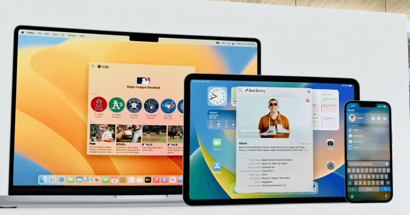 “These updates make spotlight more productive, helping you find what you’re looking for faster.”
The last sentence and slide close the loop in a number of ways. He reiterates they have solved the user problem and made Spotlight better. Visually, we have returned back to original composition. The last frame on the iPhone remains the contact view. We dove into the water and now we are back on the surface. Now only 6461 seconds more to present..
Bonus: A great twitter thread by an ex-Apple designer on his approach to building a presentation.