182992681687

It’s been fun to watch the humble ATM machine evolve.
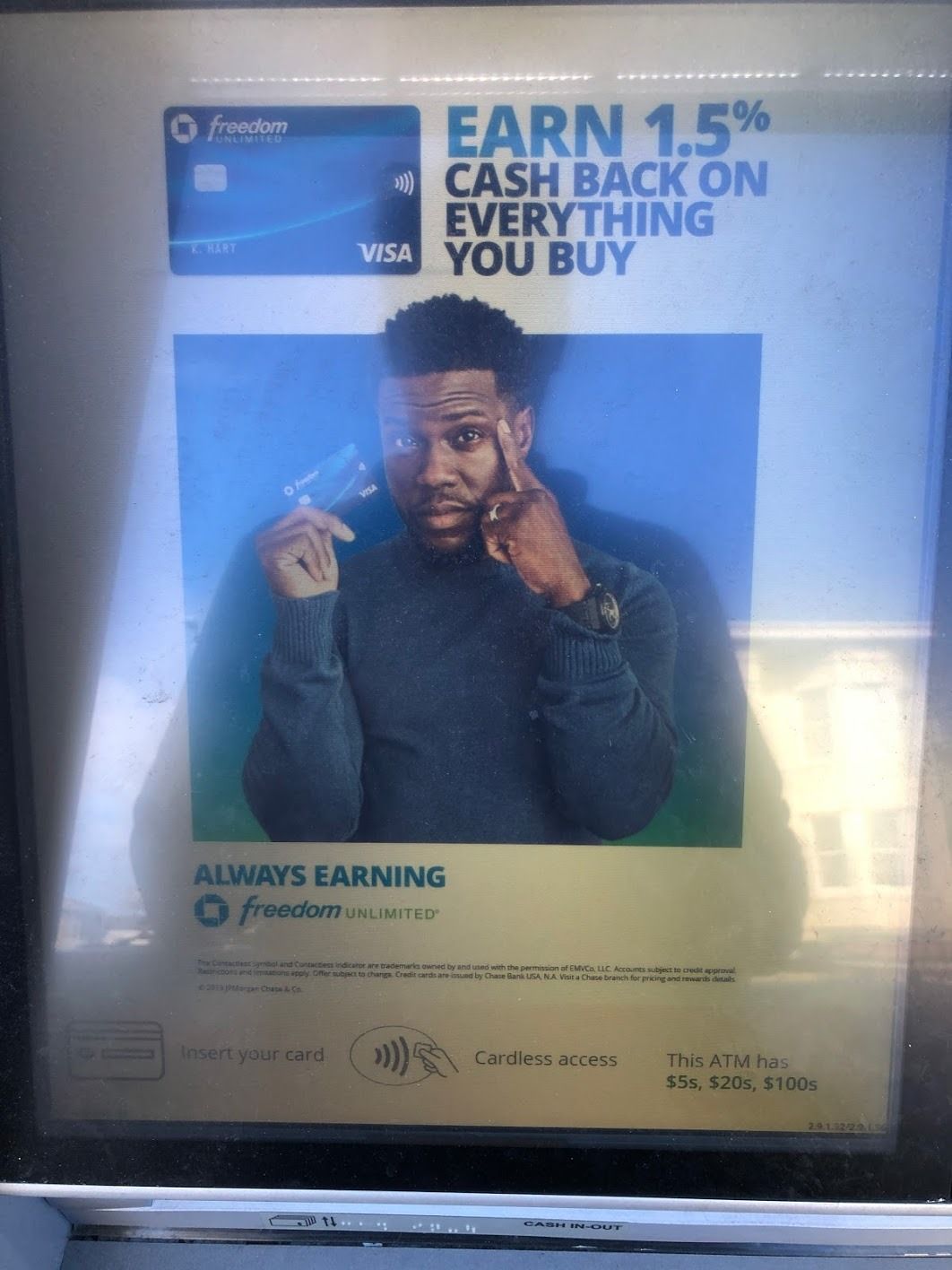
We’ve gone from a tiny, extremely low resolution screens to tiny comedians selling credit cards.
ATMs now support cardless access, welcome you by name and remember your preferred amount of cash.
It’s a bit like consumer software in general. It’s getting better, but there’s so many interests involved that it’s never close to
Designers fantasize about the perfect marriage between technology and humans, yet it very rarely is experienced during every day life.
Going back to the ATM.
The product solves a problem for a huge number of people. It’s great. I can be practically anywhere in the world, and get access to cold hard cash.
For a long time designing ‘getting cash out from ATM’ wasn’t considered from the perspective of people. Now Chase employs designers to consider exactly that. The use cases, the context, frustrations and delights of trying to complete that task.
And that thinking is slowly surfaced in the product. The software becomes a bit friendlier, a bit more intuitive.
Yet, there’s still a long way to go. Improvements to the UX now battle with giant cross-sells to other things that make more money for the bank.
Design lags.
Business, technology & design. You don’t need the last one, but glad to see it’s sticking around and proving it’s worth.