170553838527
Quite a striking email from the Hinge Team.
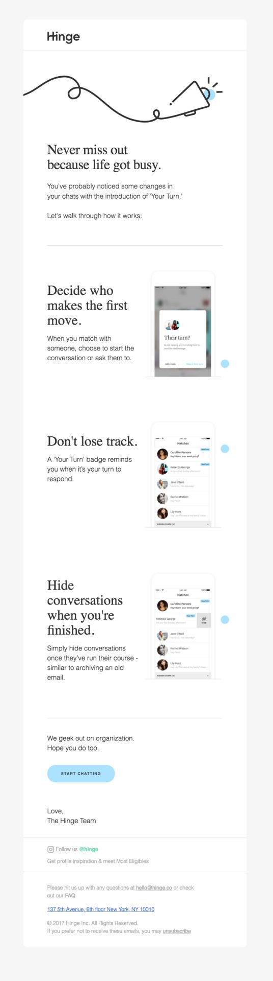
The purpose of this email is a feature announcement. The tell? “You’ve probably noticed some changes.”
Often product teams leave this sort of thing to last minute tweets, or worse, wait until their users start to email in yelling about how everything looks different, and asking for refunds. Oh that’s just my team? mops brow and loosens tie
Anyway, the point is, this is the not where effort usually goes. We’re busy putting out fires, and writing code, not drafting up lovely product announcement emails!
Usually a task like this is handled by a busy product manager who has better things to do. Seemingly not the case at Hinge. Here’s a few things that I like about it.
• The type. This email has beautiful big type. Designers might notice the serif (the pointy feet on the letters) that has long been chased off into the hills by Silicon Valley haters. Serifs are rarely seen in marketing documents, let alone UI. That’s another point. Since they prominently uses a serif typeface in their app, brand is leaking freely between product and marketing like it should.
• The color. has been applied in a smart and strategic way. I’m not familiar with Hinge’s branding outside of the app, but consider how the powder blue has been applied. At the top it’s an accent for the illustration, in the body it’s used to lead your eyes through the UI screenshots and at the end, it fills the nice big CTA button. Obvious, but sparing. The fact that it plays nicely with the cream background is a nice bonus, and you won’t see them together on mobile anyway.
• The copy. Copywriting is a personal interest of mine, and I love to see it applied with a bit of thought. All of the titles are benefits, eg. “Don’t lose track”. Losing track of conversation threads is a pain for users, and Hinge is showing us that with this new feature, it’s no longer a problem. A side note, drafting up a document like this email before you build something is a great way to frame your feature around your customer. Also, signing of with ‘love’ is a nice touch.
• CTA deep links to the app. Technology!
I think this is a good benchmark for informational-producty emails to your userbase. Clearly explain your changes, the benefits, how it works and don’t miss the opportunity to hammer in your brand while you’re at it.
Love,
Josh