149244285002
Kayak Sign Up / Sign In Funnel
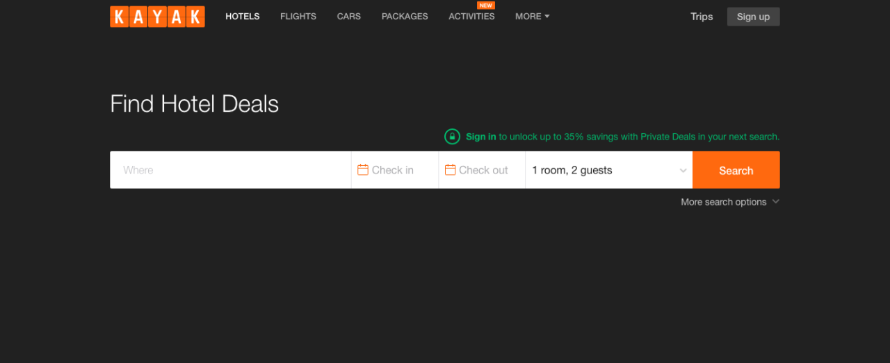
Today, landing on kayak.com, I couldn’t find the Sign In link, often in the top right corner of the screen. Weird.
Can you spot it?
UI that’s a little kooky immediately gets my attention, because there’s usually an insight, or something to learn there.
Let’s unpack this. We’ll assume Kayak wants visitors to create an account. Users with accounts are probably more engaged, buy more stuff, and visit more frequently.
They’ve also probably noticed that most visitors with accounts don’t like to sign in. Maybe they simply forget to, can’t remember their password, or are too focused on their primary job, finding a hotel or a cheap flight. Also, the benefits of signing in aren’t clear. Personally, I sign in because I have saved searches or flight alerts set up.
Here, they’ve attempted to remedy this behavior, by displaying the sign in (trigger) closer to the input fields, making it easier to find and click, and also wrapping it up with some exciting $ deal.
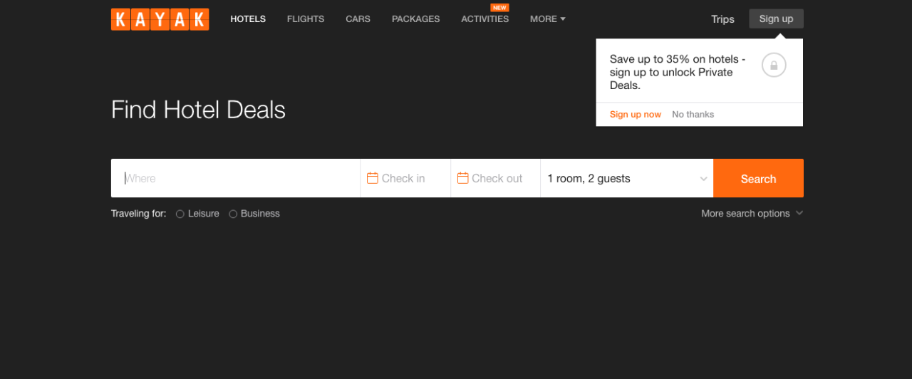
I saw this screen because I was cookied, and to prove it, I loaded up kayak.com in incognito, and boom, now as an anonymous visitor, the green text is gone.
It’s still the exact same promotion, slightly different design, and pointing to Sign Up, rather than Sign In. The basic idea is, use the promotion as bait, and funnel the appropriate users into two directions. Sign them up if they don’t have accounts, and sign them in if they do. Basic.
Sidenote: Another guess, the lead with Hotels because there’s better margin than flights.
If you’re interested in these kind of websites, the best of the best are the Priceline Group (Booking, Expedia etc). Click around and see what tricks you can find. Upsells, email captures, referrals, points, timers. You name it.
This was also a good read on behind the scenes at Expedia.