147467327407
Don’t Judge a Book by it’s cover - Part 2
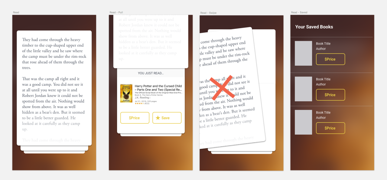
I’ve ignored best practice and jumped straight into some visual design experiments for my reading app. Standardized product design calls for a process, but this is a fun side project, so who cares. I need this to be interesting for me to keep at it.
This has really only received one sketch session (about 2 hours) of my time.
Since the idea involves reading a very small portion of text, I think there’s an opportunity to be really playful with the interactions. Maybe the text explodes if you don’t like it. Maybe character names, or locations, or interesting adverbs are highlighted. Or the genre of the book is reflected by a mood video/audio playing in bg.
The interface for reading apps like Kindle, or Instapaper, needs to be clean and simple, because if there were unnecessary elements, you’d tire of them after a few hundred pages. This app doesn’t have that barrier, and I’d like to leverage that when I make the prototype.