1332364835
Kanye West has been giving away free tracks every friday until xmas as part of his Good Friday’s promotional thang. It’s half genius self-promotion/half ‘i think i am the black jesus, listen to my songs they are art’.
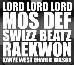
Anyway, being the hapless designer that I am, I noticed all his tracks had a similar visual style; stacked red type. I love a good cohesive campaign, it defiantly makes the message stronger and clearer. But Impact? really ye? Also the ‘F’ in Mos Def doesn’t line up to the edge and the leading is uneven throughout. I think stacked type is a really current, effective way of displaying information, but do it properly you douchebag.
In other rap news Swizz Beatz unexpectedly samples Justice’s Phantom part 2 for Gucci Time.