11041570216

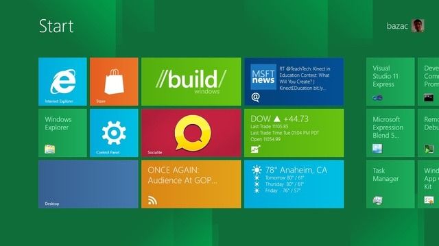
I don’t keep up to date with the current shenanigens of them windows folk, but I believe this is what the new ‘start screen’ looks like on windows 8.
I remember thinking the start button was a cool name for what was basically their version of the finder, but apparently no one uses it anymore. The taskbar (cough dock) took over, and now this start screen will hopefully become the new task bar.
It looks like a nice interface for tablets. I think the whole ‘build’ concept is interesting as it allows customization, but within a designed framework or ‘look’. I find the ioS a little fustrating as it’s a monotonous wall of icons/apps, which you can’t really customize. Customization, or tweaking is something I feel that Apple is breeding out with every update.