Interfacing the news
Before newspapers are completely extinct, and television programming looks like Idiocracy, here’s a brief overview of user interfaces creeping into traditional reporting.
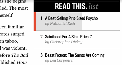
A progress bar for reading longer articles on The Daily Beast. Medium was one of the first to start measuring the word count and translating it to minutes, but I think this visual approach gives a more intuitive (and less distracting) representation than ‘minutes remaining’.
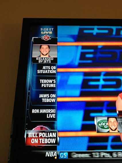
Pioneers of entertainment news and above all else reporting sports results, the Sportcenter guys are way ahead the curve, with a good portion of the screen covered in charts, stats and assorted titles. They’ll stack talk points, and even attach a countdown timers. Bored viewers can gauge how long the hosts will be talking about each story, and be reminded of what’s up next. I think we’ll see more ‘TV Aesthetics’ creep into the web and apps as screens get bigger, touch replaces pointing and clicking things and data entry in general is reserved for business stuff and niche categories.
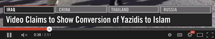
The spread of the Caliphate is very far removed from a penalty for Peyton Manning, but even Vice News uses youtube annotations as controls, allowing viewers/users to skip segments, and get a better read of upcoming content.
So, will this intense focus on the ‘total reading time’ metric and other methods of attracting and retaining attention mean the “loss of journalistic talent”?
Probably not, but the news is becoming more raw, clickable, mechanised and closer to a superbowl action replay than reading the newspaper on a park bench.